How to create a One Page website with Squarespace
When you think of a website, words like 'complex', 'extensive' and 'lots of pages' may come to mind. But sometimes more truly is less in the world of web design, and that's why, instead of taking a traditional approach, it may be worth your while to create a one-page website to start.
Don't get me wrong, there are definitely good reasons to have a big website. However, it can be more trouble than its worth when you're just starting out. It takes hours to create and update all those pages, days to add new content. And the resources required to run a big site are costly and complex.
But before we dive into the advantages and disadvantages of a one-page website and whether it's the right choice for your business, let's consider what a one-page website is.
What is a one-page website
A one-page website also called a single page or parallax scrolling website is a website that has a single page offering everything a visitor needs to take action. There are no additional pages like About, Services, or contact page. All information is contained on a single page. If you’re skeptical about what a one-page website can do, hold that thought as we explore what a one-page website has to offer
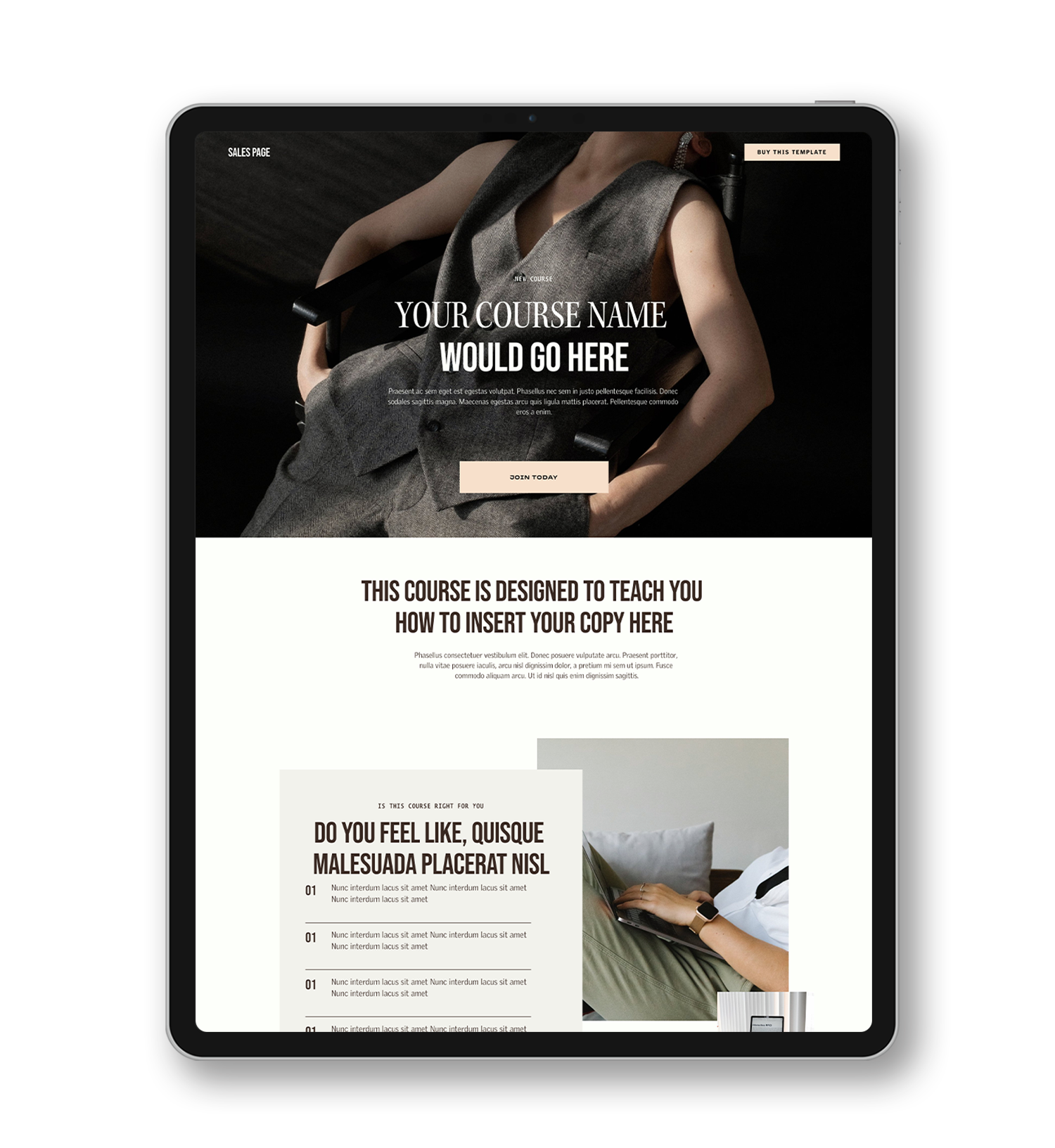
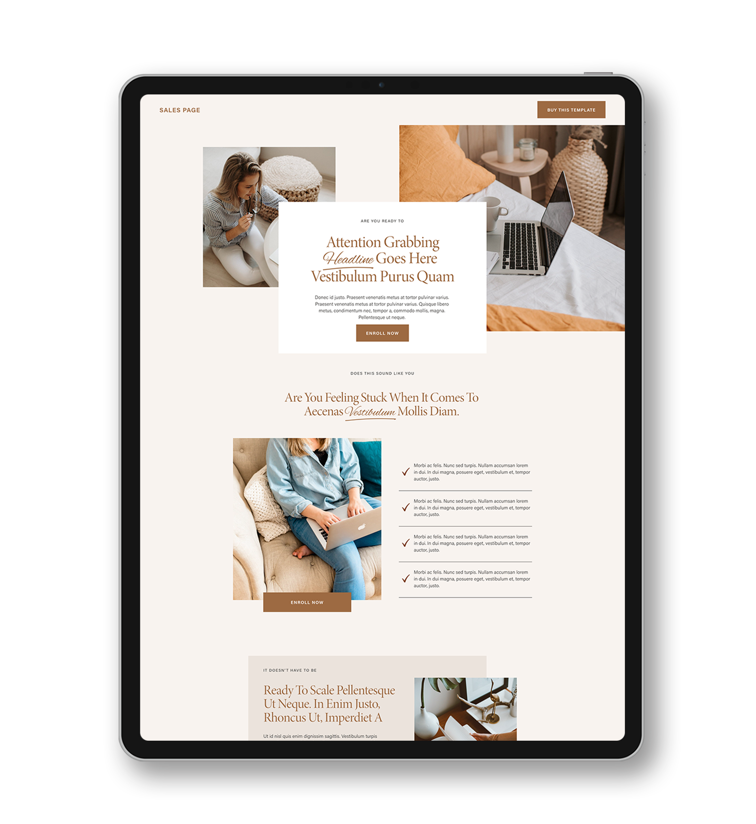
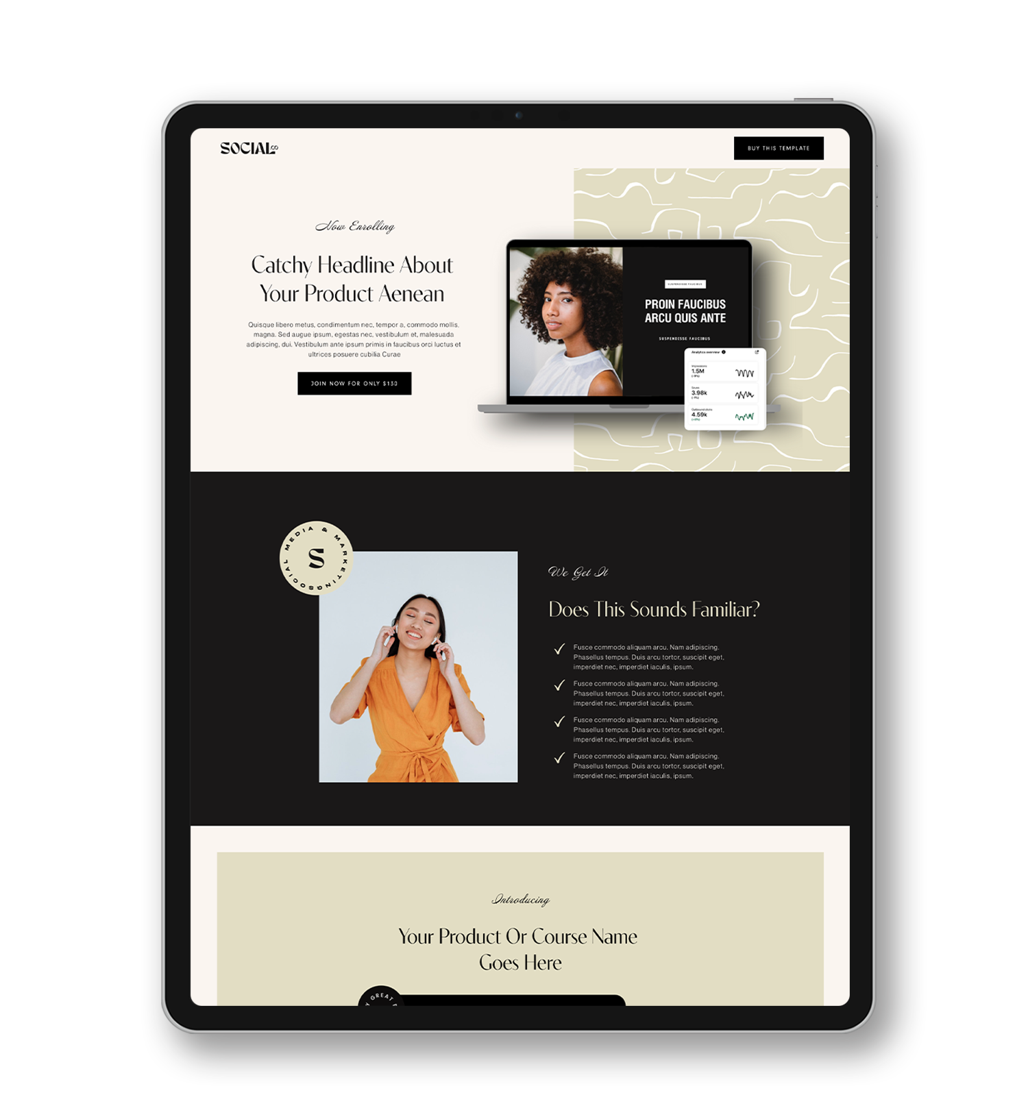
one-page website template
related article: How To Create A Blog In Squarespace ( Video Tutorial )create a one-page website using Squarespace video tutorial
Looking for a unique website design for your business? Explore our Squarespace Web Design packages for a stunning website. Need to enhance your site's visibility? Our Squarespace SEO services are here to assist you. Curious about our work? Take a look at our Squarespace website designer portfolio for some inspiration!
Pros of having One Page Website
1.It’s Mobile Friendly
Research shows that over 71% of people in the USA access websites from their mobiles. It’s also undeniable that there’s a geometric increase in the use of mobile phones and tablets across the globe. A responsive one-page website will save mobile users from figuring out how the navigation menu of the website works. (which is harder to comprehend especially if the website is content-heavy). Ever tried to order a product from Amazon using your mobile? Exactly! The navigation is harder to comprehend. It’s worse if you are a newbie.
With a one-page website, mobile users will only have to scroll through the one-page website to access information. And trust me, we don’t care to scroll because we’re used to scrolling and tapping to get things done. Not just that, we scroll through hundreds of social media posts daily, your website wouldn’t be an exception.
Also, if the majority of your audience are mobile users or will access your website through social media, then it’s best to consider using a one-page website.
2. One-page websites are easier to maintain and manage compared to multiple pages.
In the absence of multiple pages and complex information architecture, maintaining your website would be a walk in the park. In contrast, multi-page websites require changes constantly. You’d
have to think of how to make navigation easier for visitors, where to place particular information for higher conversion, and sometimes, restructure the whole pages. Not just that, mistakes can be spotted easily on a one-page website because it’s easier to scan through, unlike multiple-page websites where a mistake can go uncaught.
You can make changes to a one-page website in a few hours or minutes because of the limited amount of content present. So, when it comes to maintenance, one-page websites take the award home. Obviously.
3. Visitors tend to interact better with your CTA buttons and stay longer on your site
With a lot of things fighting for our attention, we tend to zone out whatever seems to waste time. Including websites. A one-page website contains all the important information and buttons for visitors to take action.
Research shows that a one-page website has a conversion rate of 37% when compared with multiple pages. Traditional websites have a lot of pages and links that tend to distract users and sometimes, make them overlook the most important information.
Another advantage you stand to gain is the filter-like nature of one-page websites. A one-page website acts as a filter to remove nice but not important information you’d like to add thereby making you focus on what really matters.
4. Simplicity and Flexibility
Visitors read through your website the way you want them to. If the structuring is done well, it gives a seamless user journey to your visitors. Sometimes, it’d seem like your website is answering every question as they pop up.
Due to the simplicity of one-page websites, they are pretty straightforward and there’s room for only important information. It gives visitors a clear sense of action and increases the rate of conversion.
Keeping your Squarespace one-page website simple should be one of your main goals. In the latter part, I will be showing you simple but effective one-page Squarespace websites you can learn from.
While it may seem like a one-page website is a perfect option for any type of business, there’re disadvantages associated with it that should be considered.
Cons Of Having One Page Website
What would happen if a need to add more content to your one-page Squarespace website arises? There are two possible options you can go with; First is to overcrowd the whole page if you want to avoid increasing the length of your page. The second option is to increase the length of your page to accommodate your content.
Sadly, both methods are not so good. One major con of a one-page website is its limitation to scale. Therefore, it’s best to consider where your business will be in years to come. If your business will require a blog in the future or the number of products and services offered will increase, then going for a one-page website will not be a great choice.
1.SEO
If one of your business goals is to rank on Google searches, a one-page website won’t help achieve that goal. It is quite difficult to include all your targeted keywords on one page without sounding unnatural.
Although there are ways to curb this such as adding detailed descriptions to images, competing in a low niche, or using other ranking software, it wouldn’t still produce that desirable search ranks. In contrast, multiple pages website provides a more robust system to add targeted keywords on different pages and also gives you a chance to arrange your content hieratically to achieve authority in your niche. But if most of your visitors come from social media and ranking isn’t what you are concerned about, a one-page website will work just fine.
2. It’s hard to perform Analysis
Finding out what works and doesn’t work helps every business focus energy and resources on what will yield results and neglect what won’t. And one way we do this is by using Google Analytics or Squarespace Analytics to determine the pages that have the highest traffic, track our landing page or sales funnels, and as well determine the geography of the traffic to further focus our ads to specific audiences. A one-page website, however, is harder to analyze because it’s one paged. All traffic will be directed to the page and you will not be able to determine what section yields more traffic.
For example, let’s say you notice a drastic drop in traffic, there’s no way to determine the part of the page responsible for the increase in bounce rate.
3. Sharing specific content can prove difficult
What if a visitor finds an interesting part of your website they’d like to share with friends through social media? Unfortunately, they’d have to share the whole page. Sharing specific content can be quite difficult on a one-page website. This may discourage visitors from sharing
your links although they found it helpful. The less they share, the less publicity you get. So, it’s worthwhile to consider the share-ability of your website.
Verdict
The first thing I’d advise you to do is to determine the content of your website. Carefully note down what and what you want to display on your website, if it’s something that could easily fit a one-page website, then go for it.
Also, you’ve got to determine the scalability of your business. If your business will grow fast, a one-page website would end up being inadequate to take care of your needs, but if your business offers a small range of products and you want customers to easily discover what you do, a one- page website is for you.
All in all, both websites serve a different purpose, what you’d need to do is find out what your business needs.
How to create a one-page website using Squarespace
When you are just starting out and there are few products and services to offer, a one-page website can be a lifesaver as it cut to the chase. I will be showing you how to link your navigation bar to each section on your one-page website to avoid visitors scrolling back and forth to find a section.
Here’s is an example of what I mean.
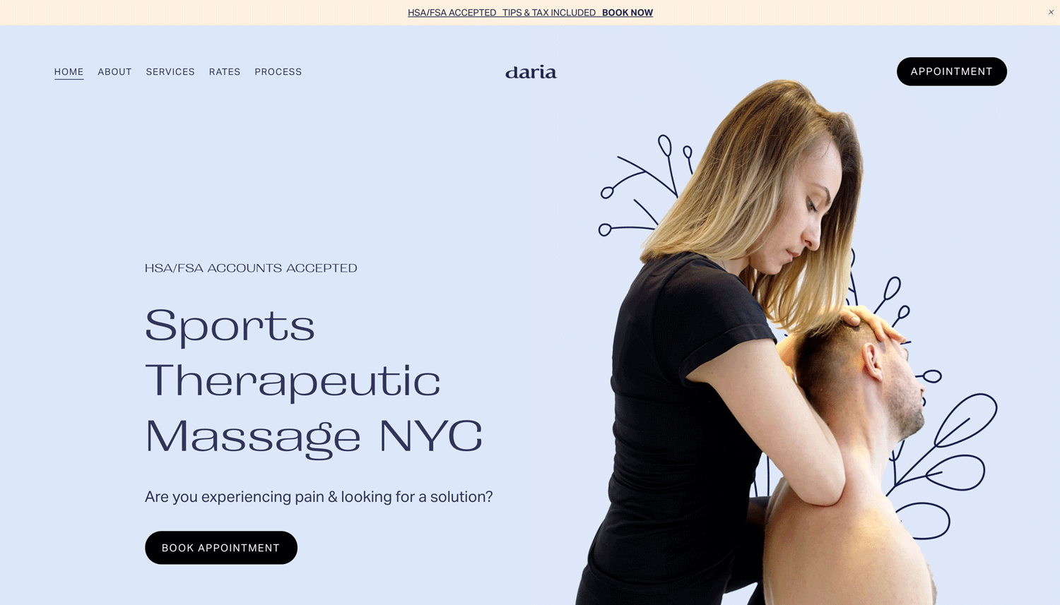
When you open Daria website and you press “ Service “ or “ About “ in the top menu, you’d notice that the page automatically moves to the About Us section on the one-page website. Cool right?
Let’s get right into how you can achieve the same result.
Step One: Create your one-page website
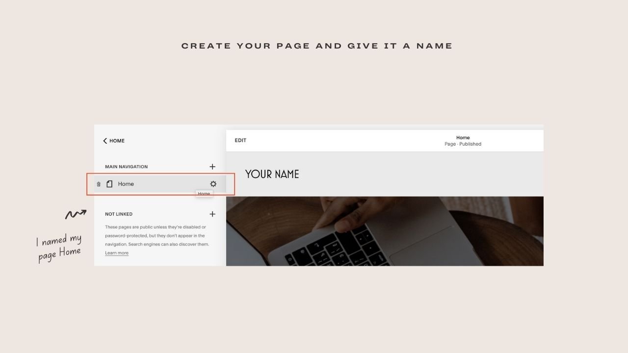
The first thing you’d like to do is go to the backend of your Squarespace website, click on Pages, and create a page.
You can decide to design your one-page website yourself or purchase a Premium Squarespace Templates one-page website offered by template shops.
If you want to DIY, create your page and give it a name that you’d remember. In my tutorial video, I named my page Home
The next thing you’ll want to do is add different sections to your website and style accordingly. To do this, go to the EDIT mode of your site. Add sections using the plus sign (insert point) on the page and style according.
Step Two: Insert code
Now that your site is ready, what’s left is to link each section to your navigation menu. Although it includes a tiny bit of code, it is super easy.
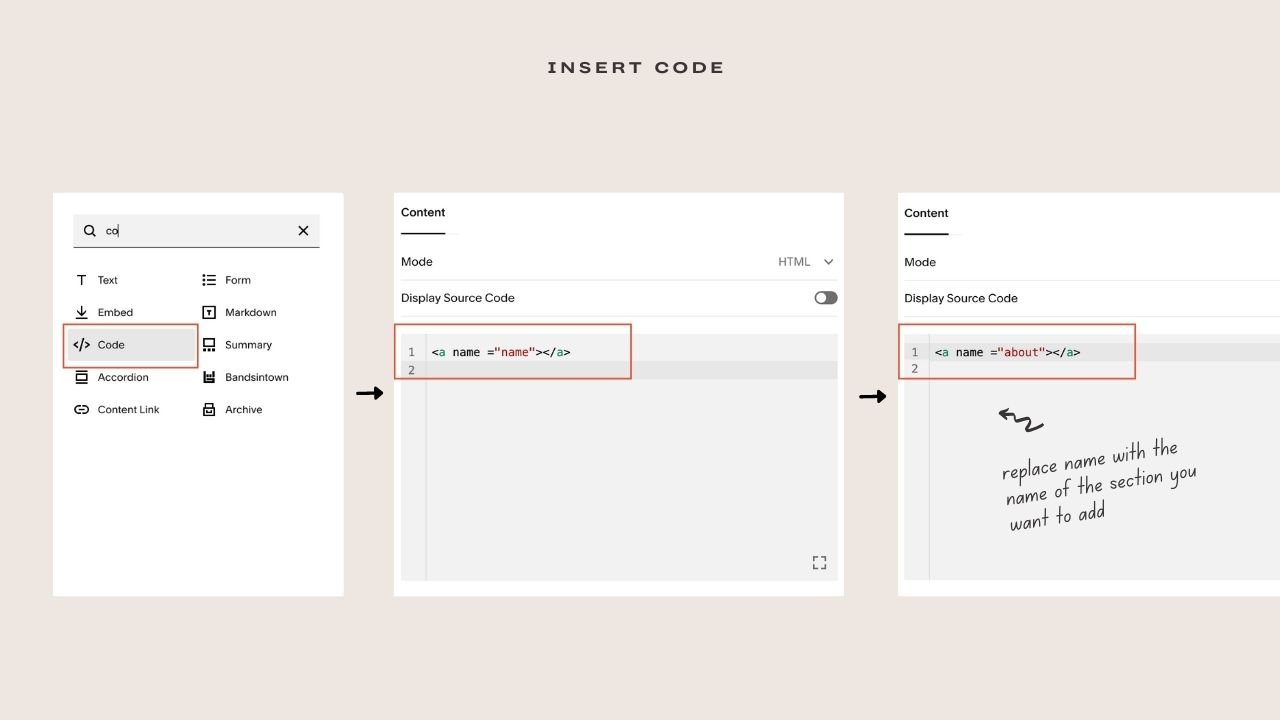
First, we will start with the code. Go to your created page and hover over the top of each section to find an insert point i.e a plus icon. Select the plus icon and a menu will pop up, search for Code and select.
A place where you’re meant to insert your code will come up. If there’s any demo code, delete and input this code
<a name ="name"></a>
You’ll replace name with the name of the section you want to add. For example, if you select the insert point above the service section of the website, it would be
<a name ="service"></a>
About section would be
<a name ="about"></a>
Repeat this for all the sections you’d like to link to. Now, here’s what you should look out for. You won’t find an insert point if you hover over a gallery block, instead what you’d find will be ADD SECTION point.
Select Add section and click Add Blank, reduce the size and then select the + icon to add the above code following the same method.
Remember to always edit the name between the parenthesis
Step Three: Link navigation to each section
The final step is to link your navigation menu to each section.
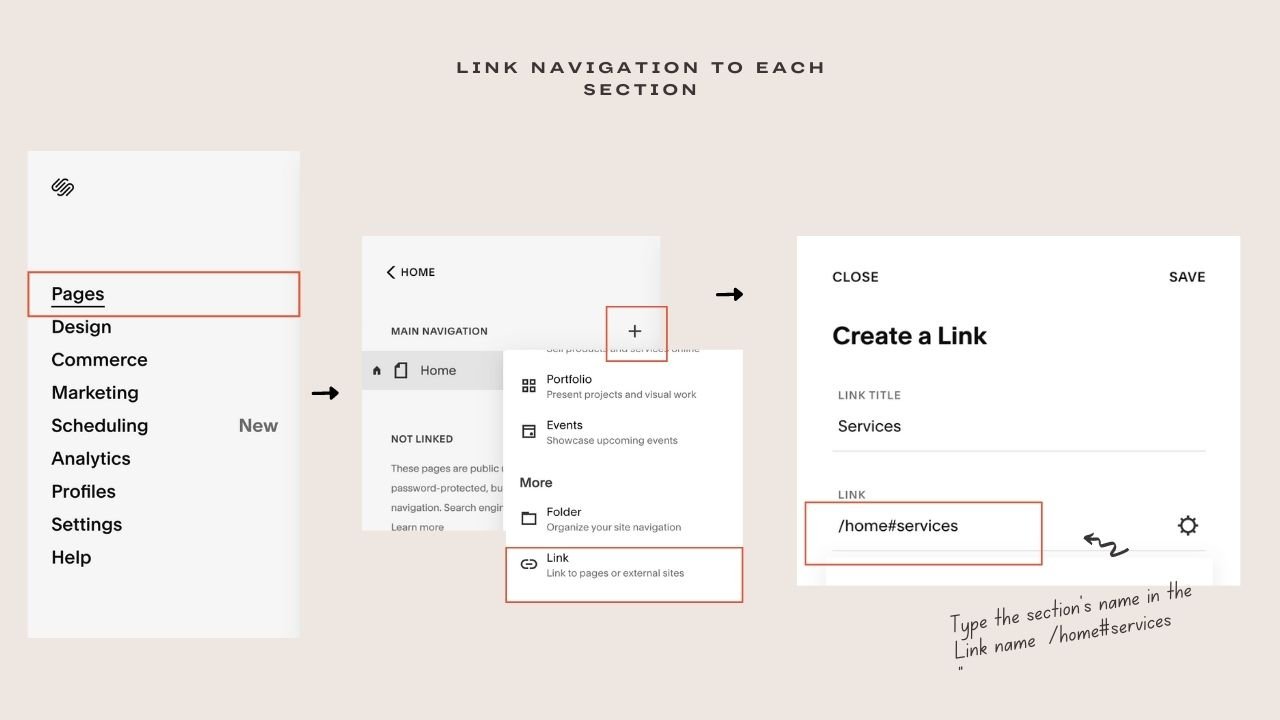
Go to Pages, click the plus icon beside the Not Linked, and select Link
A menu titled Create a Link will appear. Type the section’s name in the Link name space and then insert this code in the link section.
/home#services
/home#about
Home represents the name of your page. So, if you titled your page ‘Sidebar’, it would be /sidebar#services
To confirm that your page’s name is correct, hover over your created page, a gear icon would appear, click on it to check out your URL slug. Your url slug should have the same name as your page.
Also, Services represent the name of your section. When you want to link to your About, it would be
/sidebar#about
Once you’ve done this, click Save. You’ll find out that the link appears automatically on your navigation menu.
Once you click on Services, the page automatically scrolls to the service section.
Repeat the process for each of your sections.
There you have it! A functional one-page Squarespace website that allows visitors to jump to important sections. If you had trouble understanding any of the steps, there’s a detailed video tutorial explaining each step.
One-page website Examples
Daria Massage Therapy
Talk about a one-page website done well! This particular website succeeded at creating a seamless user journey for every visitor. Let’s start with the basics.
The first thing you’d see as you land on the page is a bold and big text telling you what the site is all about in a few words. It’s then complemented with an image showing the masseur working on a client. This helps visitors instantly know what they stand to gain as they go through the website.
Now, the thing that is more impressive is the ‘HAS/FSA ACCOUNTS ACCEPTED’ text. This shows that detailed research was carried out to find out one of the popular problems prospect clients do face and it was put first to relieve any prospect client worried about payment.
As you scroll deeper into the page, you’d discover every section is intertwined to give the visitor a 360-degree view of what they would get.
Also, the CTA buttons are strategically placed to compel visitors to act. Did I forget to mention that she made use of a popular but effective marketing strategy of giving discounts?
Overall, this one-page Squarespace website visuals are top-notch and complement the copy. Wondering where you can get something similar to this? Kseniia design studio designed this website and wouldn’t mind bringing your dream website into reality.
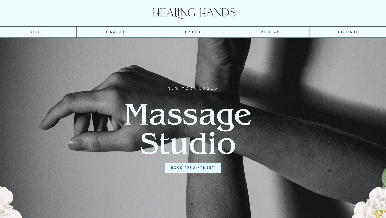
Healing hand massage studio is another one-page website that skillfully presents its services without any fluff. I would want you to focus on the use of imagery throughout the website. One of the subtle advantages of a one-page website on Squarespace is that you can expressively use images to enhance the services you are passing across without boring the visitors. On the Healing Hands website, images were used to complement each copy, especially in the services section.
If you are thinking of creating a one-page website, make sure you use images and add meta descriptions to further enhance your chance of SEO ranking. Apart from that, images have a way of explaining better than your copies.
Elena Komer Permanent makeup
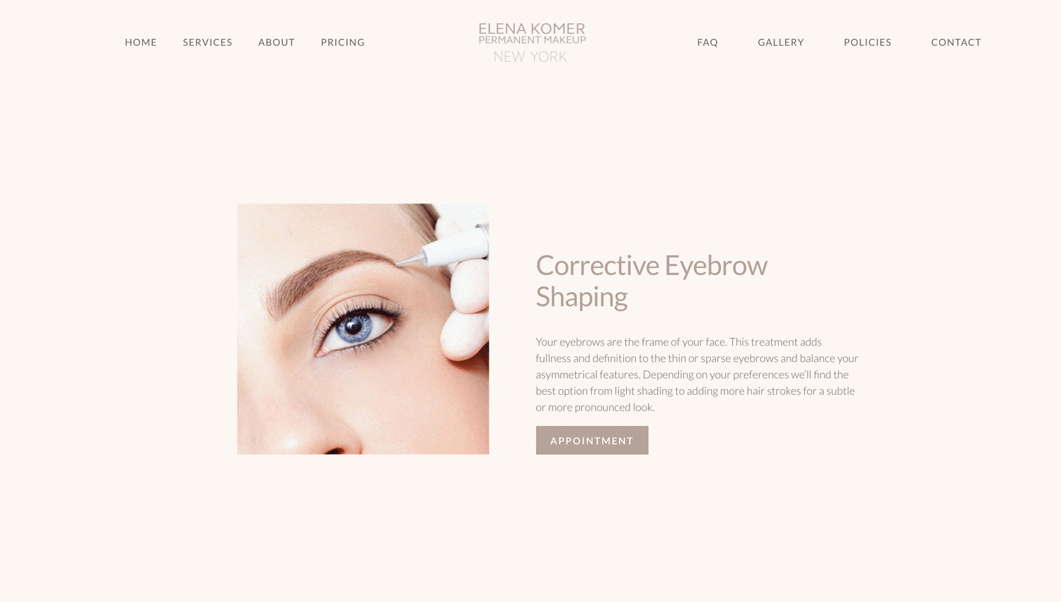
Here’s one of the shortest yet converting one-page websites you can model after. Trust me, you don’t have to add too many sections to have a booming sale. I believe the designer focused on the most important information needed on the website to drive sales and stuck with it.
You can get everything needed to make a decision in less than one minute of scrolling and that saves your visitor from being confused. Elena's website went straight to the services they offer, how much they cost, and visual testimonials to convince you. Still, have questions? The FAQ addresses almost every question a visitor will have. Simple.
When creating your website, always focus on the most important things that are beneficial to your website and will drive sales. Any other lovely sections can be discarded.
There’s one thing you should notice. Elena started with an introduction of herself that was complemented with a beautiful image rather than starting the traditional way. For starters, it allows visitors to connect with her passion and see the need to let someone like her render her services to them. Also, the beautiful image used may convince visitors that she doesn’t only beautify other faces but she has a beautiful face as well.
However, doing this may not work for your type of business. If unsure, it’s best to stick to the traditional way.
creating a one-page website on Squarespace
Deciding whether to go for the latest one-page website or the traditional website depends on various factors. One of them is your business growth. Find out if your business would grow geometrically in years to come. Will the number of products and services increase? Will there be a need for a blog? Will your products and services be divided into categories?
If you answer yes to a majority of these questions, then going for a multiple-page website will be a lifesaver. Now, if you offer a limited number of products and services and you are not so concerned about SEO, one-page websites are simple, straight to the point, and have higher conversion rates. So, that may be the best decision.
Thinking of creating a Squarespace website? Check out our template collection designed to satisfy your business needs or reach out to us to create a custom-made website.
Our expertise is building Squarespace websites tailored to meet your target audience's needs, highlight your brand, and make your website stand out.
If you find this post helpful, kindly comment in the box below. Have any questions? Feel free to drop them in the comment box.

