26 Canva Font Pairings For Your Next Design
Fonts have the ability to mar your design or turn it into a mind-blowing piece. Either one of these can be achieved depending on the font you choose. So, how do you decide the best font for your next design? I have come up with 26 Canva Font Pairing that will help you create stunning, breathtaking designs that both your clients and viewers will love.
Let’s get right into these stunning Canva font pairings that will make your designs stand out.
RELATED ARTICLE: 47 BEST ART DECO FONTS FOR ANY CREATIVE PROJECTSLooking for a unique website design for your business? Explore our Squarespace Web Design packages for a stunning website. Need to enhance your site's visibility? Our Squarespace SEO services are here to assist you. Curious about our work? Take a look at our Squarespace website designer portfolio for some inspiration!
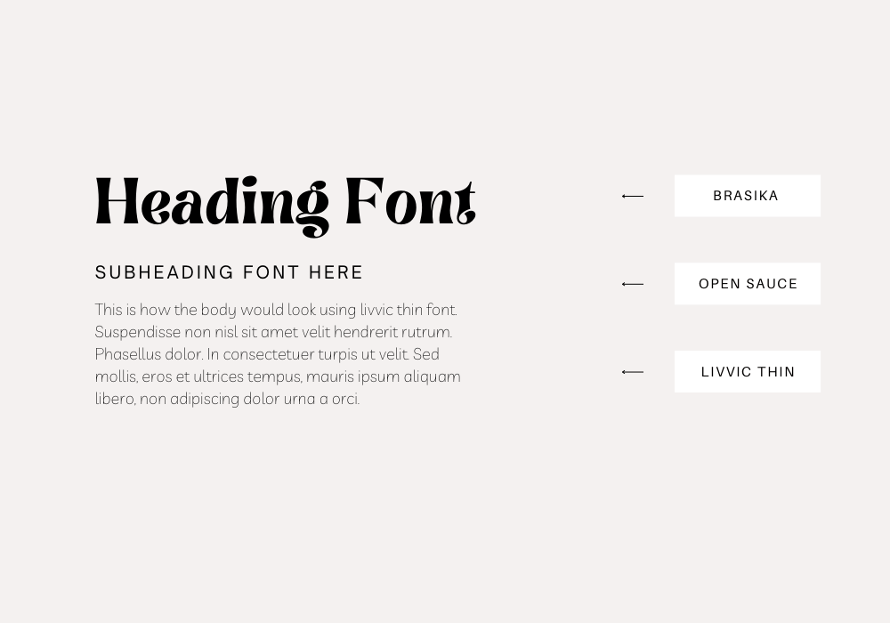
Brasika, Open Sauce, and Livvic Thin
If you want to achieve that sleek, seamless look in your design, then this font combination is the deal. Brasika sets the mood with its swirly, bold, and fun font that presents your heading in a fun yet authoritative manner. Now, combining with Livvic thin as the body text takes your design to the next level. Livvic thin was created specifically for a better view of small texts on screens and print. So, if you are looking for a legible, clean font that makes your text readable, Livvic thin does the magic. Open Sauce crowns it all up with its beautiful, modern font serving as the subheading. This font combination is versatile for different categories of design.
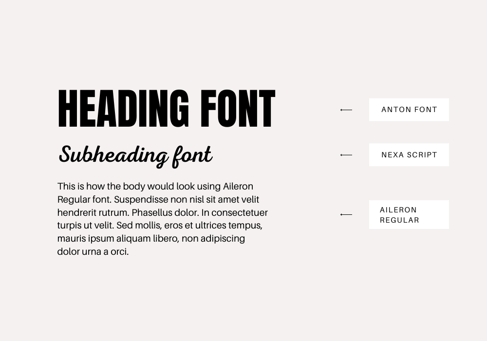
2. Anton, Nexa Script and Aileron Regular
I love this font combination because they all balance out their extremes so well to create a perfect sync. The heading font Anton has this bold, traditional typeface that was used in the advertisement industry in the past century. Anton gives your design a bold, unforgettable look. When balanced out with Nexa Script, it gives a modern, soothing look to the eyes. Nexa script gives this clean, elegant vibe to your design that makes your subheading stand out. Aileron Regular delivers well as the body font because of its clean, Neo-Grosteque attributes.
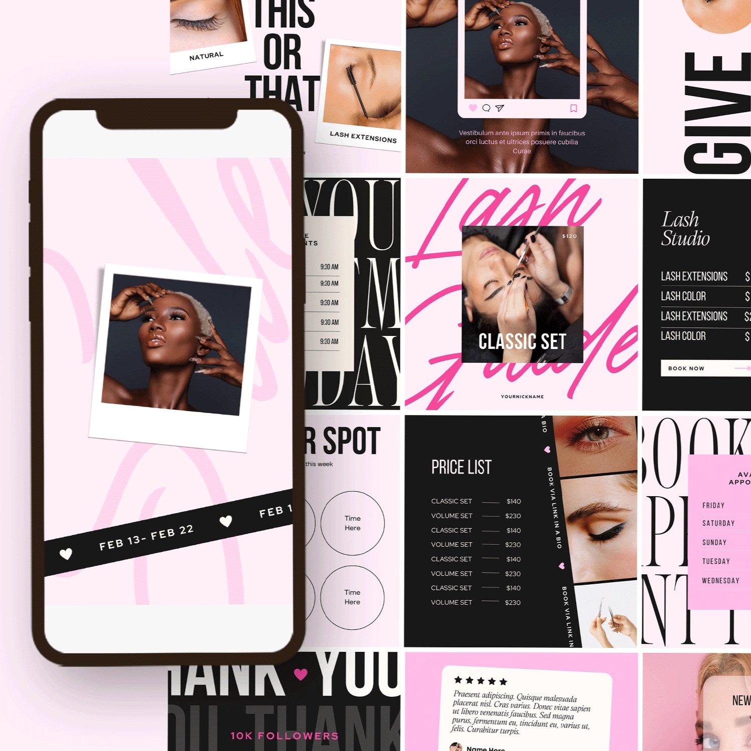
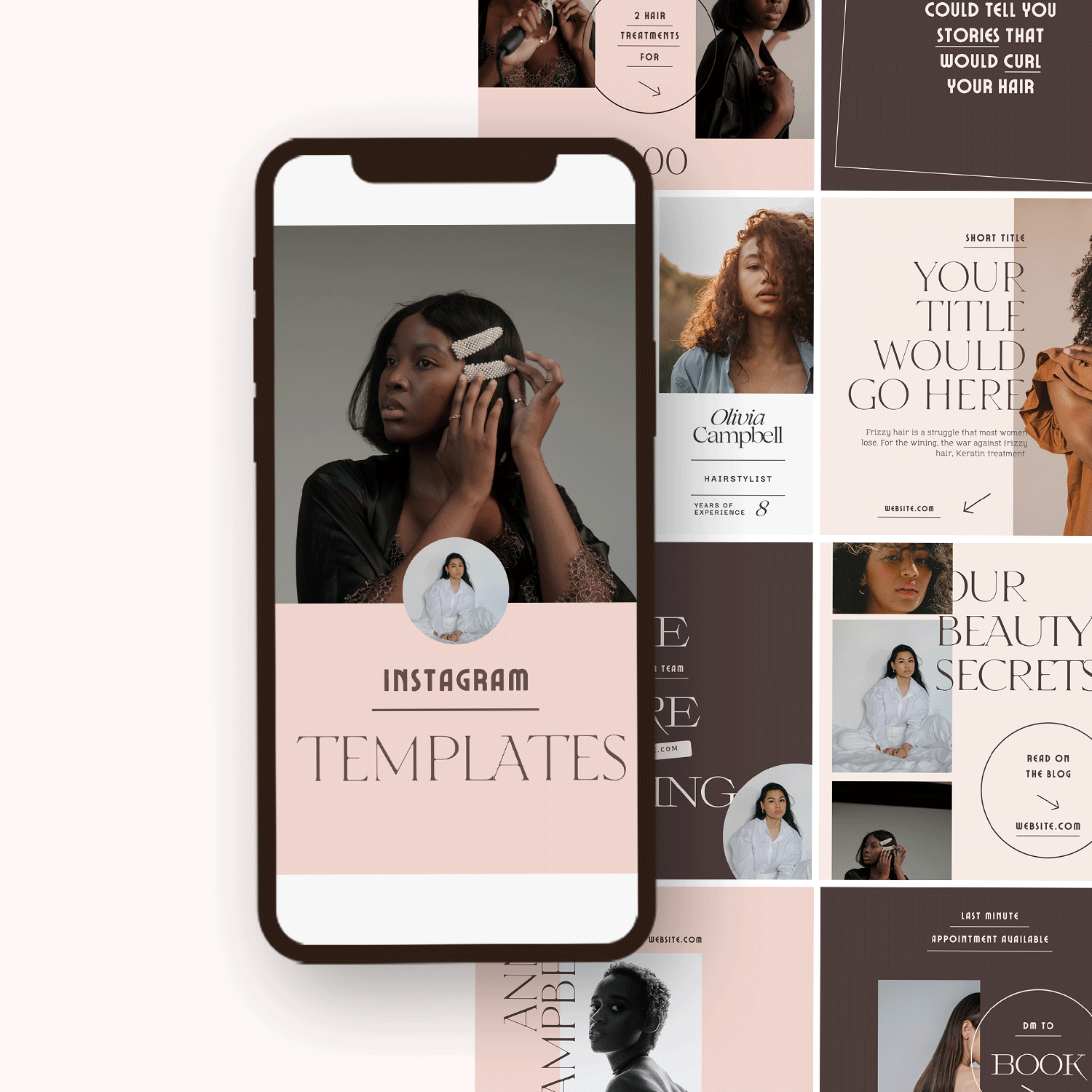
Canva Instagram templates for every taste
If you love to play around with templates but don't know where to start, we have you covered. Here are some of our favorite design templates to get you started on your next project. Great design goes a long way and makes your reader feel engaged and excited when they see what you have to say.
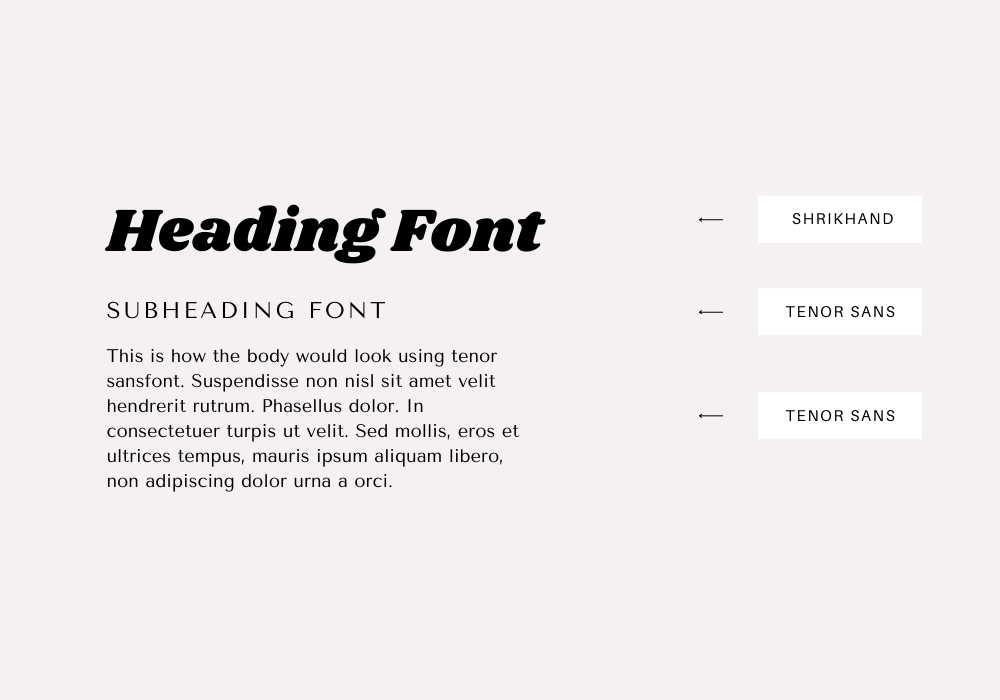
3. Shrikhand and Ternor Sans
Shrikhand gives me goosebumps whenever I see it as the heading font on websites. Shrikhand combines both boldness and modernism like a pro!. Shrikhand always makes its presence known in any design with its bold, expressive, and big letters that add a touch of confidence to any design. Tenor Sans on its own is a font designed specifically for body text and was optimized to still be legible and clean even at small sizes. The combination of Shrikhand and Ternor Sans adds boldness, modernism, and simplicity to your designs.
4. Bellaboo, Arimo and Space Mono
I won’t lie, this font combination gives you the feminine and retro vibe at the same time. Bellaboo sets the pace with its fun, swirly and feminine font. It gives your headings a touch of elegance and fun at the same time. You strike a balance when you combine Bellaboo with Arimo, which is a more serious and straightforward font. Space Mono uses its geometric and grotesque attributes to create a retro, clean and legible body text for your design. If you are looking for a Canva font pairing that will give your design a touch of elegance, a serious and modern vibe at the same time, then this font pairing is for you.
5. Youngest Serif, Parisienne, and Eastman Pack
Youngest Serif makes your heading stands out with its lush serif typeface. It gives your design a trustworthy feeling and also makes viewers perceive your design as professional. Parisienne balances out the seriousness of Youngest Serif with its casual, free-spirited script font. Parisiennes is great for subheadings to lighten up the mood. Eastman Pack comes into the picture as the body text font because of its versatility. Its robust geometric structure gives your body text a legible, regular feeling. This font combination is great for professional business designs like Law firms, Healthcare, and Investment companies that still want to add a touch of fun.
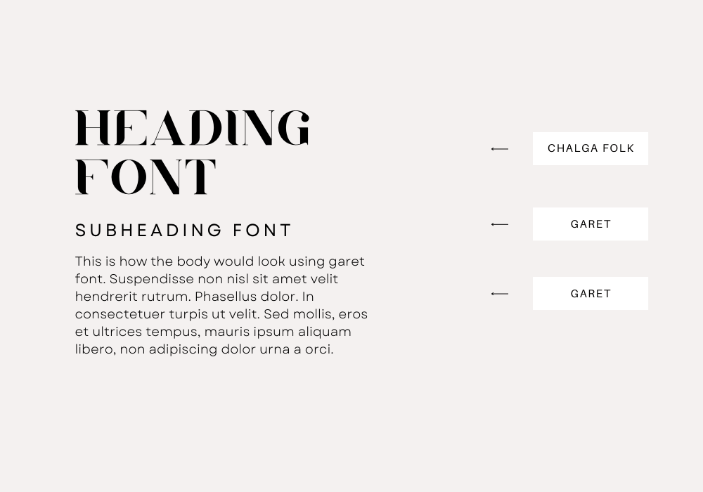
6. Chalga Folk and Garet
Want a more dynamic, rule-breaking font combination for your design? You don’t have to look further. This canva font pairing was created to give your design a touch of uniqueness and to make your design break free from the conventional fonts. Chagla Folt is a vintage elegant font that has unique lettering with its bold and extremely thin strokes. It gives your headings a classy, vintage look. When combined with Garet as the subheading and body text font, it does magic. Garet is a more modern, soft, and smooth masculine tone font that makes your heart melt. Literally. It has light, geometric, and clean characters that make it great for a long body of text.
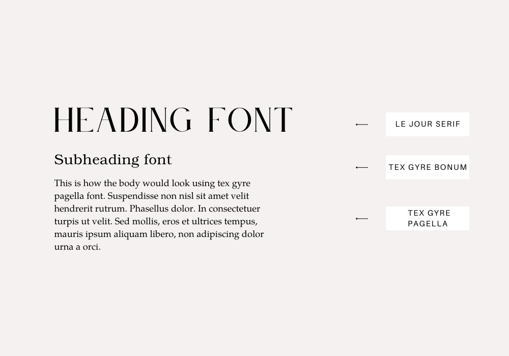
7. Le Jour Serif, Tex Gyre Bonum, and Tex Gyre Pagella
Le Jour is a beautiful, calligraphy serif font that gives a clean, luxurious feeling to your headings. Its sophistication comes from its simplicity and will make your design stand out. Tex Gyre Bonum Regular works well as the subheading. It gives out a more subtle, soft look. Tex Gyre Pagella combines well with these other two fonts as the body text font. Tex Gyre Pagella has a more legible, modern font that will get readers hooked. The canva font pairing is versatile and can work for different types of designs.
8. Migra Extrabold, Ibm Plex Mono, Playfair Display
Go extra bold with your design with Migra Extrabold. Migra Extrabold, just like it sounds, is a bold font that makes every sentence stand out. It is great for headings and its dynamic curves and strokes add a bit of elegance to it. IBM Plex Mono, on the other hand, is a more versatile font that appears soft. Playfair Display comes with clean, simple characters that add a touch of creativity to your design. This font pairing is great for creative and editorial designs.
9. Tan Paradiso, Ibm Plex Mono, Cooper Hewitt
Tan Paradiso is a quirky, elegant font that will create an unforgettable memory of your design in viewers' minds. Its unique, Greek-like characters make it suitable for varieties of project that wants to appear fun and elegant at the same time. IBM Plex Mono and Cooper Hewitt both work great as the subheading and body text font, respectively. They have great legibility, and simple and straightforward text that balances out the Tan Paradiso font.
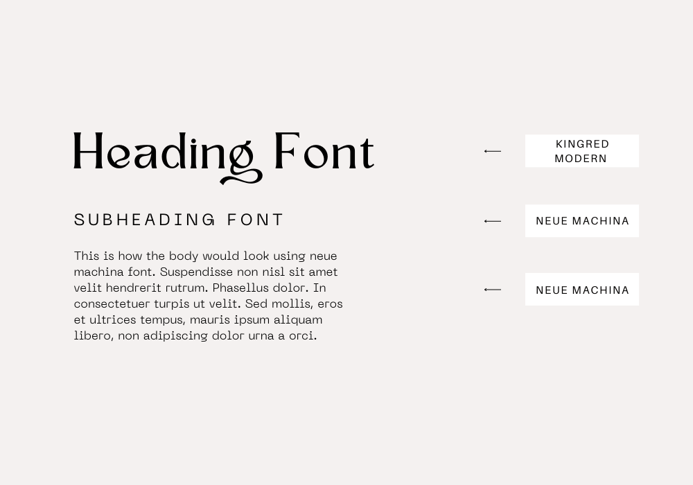
10. Kingred Modern, Neue Machina, Neue Machina
Another canva font pairing is chic and elegant. Kingred Modern is a vintage, chic and classy font with swirly swashes. This font will definitely give your headings an elegant, chic look. Neue Machina adds more sophistication to the overall look with its powerful, meticulous look. This font combination will bring elegance, and sophistication to your design. This is a go-to canva font pairing if you are creating magazine, editorial, and posters designs.
11. Nove, Anastasia Script, Red Hat Display
Nove is a dynamic font created to add uniqueness to your headings. Each letter is made up of cutout-like thin and bold strokes that make the font unique. When Nove is combined with Anatasia Script as the subheading text, you create a stunning finish. Anastasia is a calligraphy script font designed to bring creativity and style to whatever design is being used. The red hat Display crowns it up by adding a feeling of freshness to the overall look with its soft geometric letters. I will recommend this canva font pairing if you are looking to achieve a soft, luxurious look.
12. Tan Meringue, Helveticish, Hind Guntur
Looking to achieve an overall simple, yet dynamic look? Look no further. Tan Meringue has dynamic soft curves that create a smooth, soft feel to your headings. Helveticish comes in with its simple, clean look as the subheading, giving your design a clean, minimalist touch. Hind Guntur enhances these two fonts with its medium san-serif characteristics. Hind Guntur will make your body text clean, and legible for every viewer. Tan Meringue, Helveticish, and Hind Guntur is a font combination that will give your design that simple look.
13. Stadio Now Weirdo, Rugrats Sans, Stadio Now Devanagari,
Stadio Now Weirdo is a dynamic font that features reverse contrast with its horizontal line being thicker than the vertical line, giving it a weird look. It gives any design a fresh breath of creativity. Rugrats Sans is a high-quality sans font that is great for your subheadings When combined with Stadio Now Devanagari which is part of the family of Stadio Now, your design becomes a state of the art. Stadio Now Devanagari goes well as the body text font because of its spacing and legibility.
14. High Cruiser, Fraunces Thin, Fraunces Thin\
High Cruiser is a bold and modern sans serif font that gives a strong, stunning visual impact. Its elongated characters create a unique picture in your viewer's mind. Fraunces Thin takes its rightful place as the subheading and body text font because of its soft serif and vintage nature that reminds your viewers of the 20th century. The well-crafted nature of Fraunces Thin gives a unique detailing to your design. The combination of these fonts creates a wholesome balance in your design. Great for editorial designs, and mainly any type of design.
15. Black Mango, Alex brush, Quattrocento
This canva font pairing screams luxury and elegance! If you are looking for a font that will sweep viewers off their feet and make them stare longer than usual, then Black Mango, Alex Brush, and Quattrocento font combination is your plug. Starting with Black Mango, this font screams elegance with its lush contrast between the vertical and horizontal lines and its soft curves. Alex Brush comes in with its elegant script letters that will make your subheadings pop, and Quattrocento takes home the show with its clean, serif, and legible font.
16. Gliker Semibold, Charm, Exo 2 light
Create a sleek, bold heading with Gliker Semibold. The thickness of each character adds emphasis to every word in your design. Charm will charm your viewers with its elegant and curved-out lines, while Exo 2 Light will introduce a modern feel to your design as the body text font. Gliker Semibold, Charm, and Exo 2 light combines boldness, modernism, and elegance in a seamless way. This font duo is sure to enhance your design and create sweet memories in your viewers' and clients' mind.
17. Kompot, Russkopis, Yasmin
Another font pairing to enchant your next project. Kompot is a versatile san serif font that works great for any form of design project. One good attribute about Kompot is that it can be reduced to smaller sizes without losing its sharpness and quality. Russkopis is a cyrillic cursive script font that pairs well with Kompot font. Yasmin is an elegant, font that makes your body text more expressive. Even if you decide to you Yasmine for your subheading font, you will still get a great result. Yasmin adds a touch of perfectionism to your design with its geometric patterns.
18. Ukij Kawak 3D, Pushkin High, Suranna
Going for a traditional, 19th-century look? Ukij Kawak opens the floor with its vintage, traditional typeface popular in the advertising industry in the 19th and early 20th centuries. It has a cool effect to it with its shadows. Pushkin High was inspired by the autograph of Alexander Pushkin. It has an imperfect, handwritten nature that makes it organic. Suranna as the body text font adds a modern touch to the overall vintage feel. This font combination is perfect for designs targeted to bring out the traditional print age.
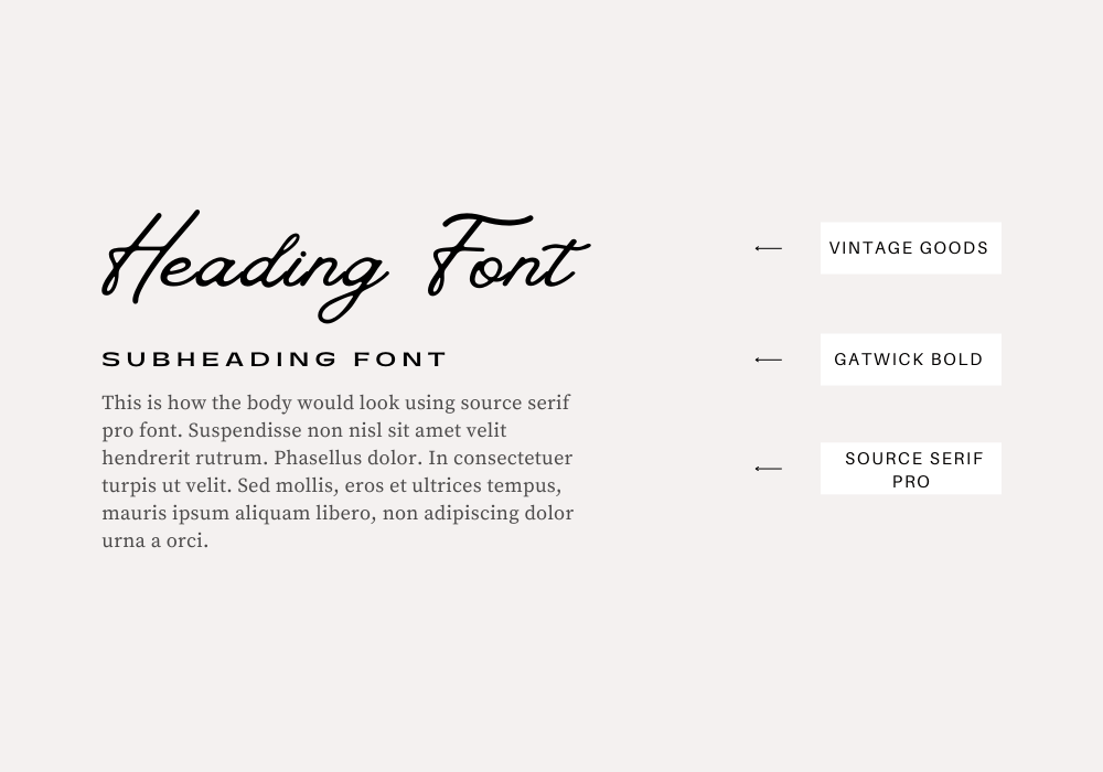
19. Vintage Goods, Gatwick Bold, Source Serif Pro
Vintage Goods was inspired by the 1980s, a period when calligraphy was discovered as a typeface. The typeface was created to connect with human emotions and add a stunning look to your designs. Using Vintage Goods as your heading font is a great choice. Gatwick Bold, when paired with Vintage Goods, adds boldness to your design with its fat and bold characters. Source Serif Pro gives a tone of seriousness to your design when used as the body text font. A great Canva font pairing for your next design.
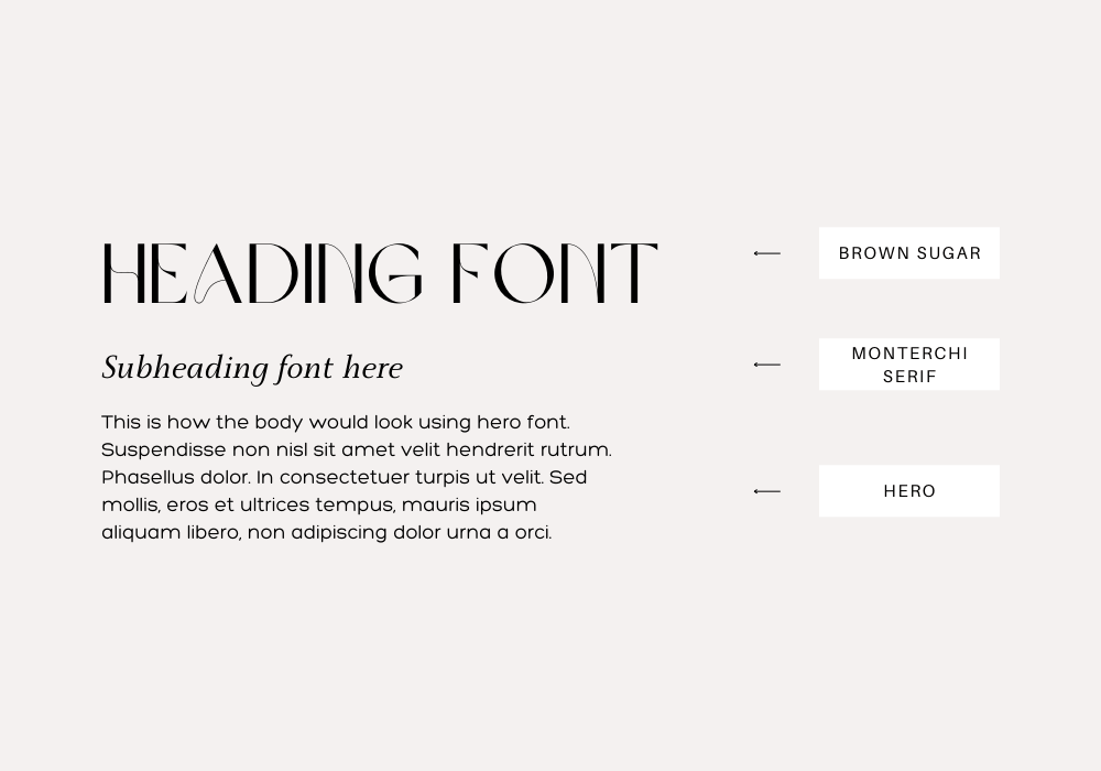
20. Brown Sugar, Monterchi Serif, Hero
Modernism at its peak. Brown Sugar can turn any design around with its elegant, and modern letters. You can’t help but admire how it makes even the most boring heading become a breathtaking one. Brown Sugar is one of my best fonts for design, especially if I want to make by design modern and luxurious. Monterchi Serif also delivers well as the subheading font with its lush letters. Hero rises up to the challenge and transforms your body text with its legible, clean font. If you are thriving for a modern, elegant look for your design, this font pairing should be your choice.
21. Poiret, Noto Serif Display, The Youngest Serif
I came up with this font pairing because of minimalism. I realize that font plays an important role in achieving a clutter-free, minimalist design. Poiret enters as the heading font with its simple, clean light forms. Poiret is a simple and graceful font that shines through with no stress. Noto Serif Display further enhances this graceful flow with its modern structure. The youngest serif works perfectly as the body text to achieve that graceful, minimalist look.
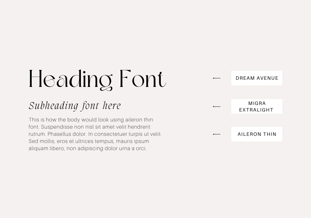
22. Dream Avenue, Migra Extralight, Aileron Thin
This is another elegant and classy font combination. Dream Avenue is a serif font with a modern, classic style. It gives you that classy and elegant vibe with its unique lettering. Migra Extralight complements the other fonts perfectly and gives your subheading a shine. Aileron Thin works best as the body text font because of its legibility and clean nature.
23. Migra Extralight, Tenor Sans, Tenor Sans
Migra Extralight is a modern serif font that communicates trust to your viewers. Its sharp ears and loops give it a more defined and trustworthy structure. Ternor Sans Serif font works great as the subheading text because of its simple, wide lettering that makes your subheading stand out without overshadowing the headings. Tenor Sans as the body text is a great choice because of its legibility and simplicity.
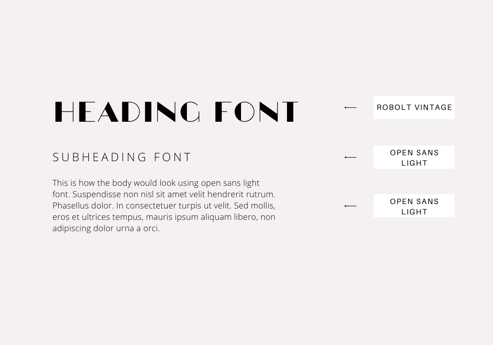
24. Robolt Vintage, Open Sans Light, Open Sans Kight
Robolt Vintage comes with high contrast extra thick vertical lines and extra thin horizontal line giving it that unique look. Robolt Vintage will make any heading stand out. Open Sans Light comes in as the subheading font because of its uniform strokes and lines that give your subheading a simple look. Using Open Sans light as the body text font as well balances out the extreme sides of Robolt Vintage with its simple look.
25. Pirate One, Fraunces Thin, Fraunces Thin
Pirate one is a gothic textural font with condensed structure and spacing that gives your heading a bold, unique feel. It has cut-out-like ends that add a touch of vintage to it. Fraunces Thin is perfect for the subheading and body text font because of its simplicity.
26. Crushed, Alex Brush, Quattrocento
Crushed is a simple, bold font perfect for headings that want to go straight to the point. It communicates a serious and trustworthy tone to your viewers. Alex Brush neutralizes the serious tone of Crushed with its elegant, and feminine letters. Quattrocento as the body text font gives your design an overall simple, elegant look.
Canva Font Pairings For Your Next Design
That's a wrap! Hopefully, you were able to find a few new additions to your font collection to make the next Canva design even better. If you enjoyed this post, be sure to check out our:
40 Free Canva Cursive Script Fonts. 