
55+ Stunning Squarespace Website Examples (2025)
You like Squarespace? So do I! It makes building an online presence for minimal-to-no-spend possible. But inspiration is what makes it exciting. Before you start, you’ll want to make sure to get inspiration for your ideas to create a cool website. There are two ways of doing this. You can find an existing site with features you like and use it for reference, or you can look for design ideas to spark your creativity. When designing a Squarespace website, either approach can help you get inspired before starting your next project.
Whether you’re building your first or next Squarespace website, you will find a lot of inspiration and great examples here. I’ve compiled a list of companies using Squarespace and included some fantastic websites examples to spark your creativity and help design your next masterpiece! Getting your business online is essential for standing out in a competitive market.
Looking for a unique website design for your business? Explore our Squarespace Web Design packages for a stunning website. Need to enhance your site’s visibility? Our Squarespace SEO services are here to assist you. Curious about our work? Take a look at our Squarespace website designer portfolio for some inspiration!
Need help building your business website?
So you have a business and you need your own website, but you don’t have the time or patience for it? A graphic designer can help create a visually appealing and immersive site that captures attention through vibrant colors and animations. I can help. Get familiar with my work, or check out Squarespace Web Design Package.
Photography and Art Websites
Squarespace is a popular platform for photography and art websites. Here are some inspiring examples:
Lily - Squarespace Template Website


The Lily Squarespace website template is one of the premium templates designed for photographers, artists, and graphic designers. This beautiful layout will bring your work to the forefront and give you a professional online presence without any effort.
Having a dedicated services page on your website can further enhance your professional presentation by clearly outlining the various services you offer.


A website that features a unique and dreamlike aesthetic. The use of whimsical design elements and a soothing color palette creates an immersive experience for visitors.
Katie Monroe - Photographer


Katie's photography website features a sophisticated layout that elegantly showcases her work, enhanced by animations that encourage visitors to scroll and explore. The design efficiently presents all her offerings within just a couple of scrolls, demonstrating excellent use of layout and information architecture to let her stunning photography be the focal point.
She chose the Isabela template, which simplified the design process significantly. I collaborated closely with Katie to bring her vision for the ideal photography website to life. Interested in a similar design for your site? Let's get started on your project today!
The Headshot Gal - Custom Website Design


This website was tailor-made to meet the client's needs, and she was thrilled with the final result. If you're impressed by this site and wondering who could create something similar for you, be sure to visit our service page!
Headshot Gal is a consummate professional whose headshots consistently impress. Her work has appeared in renowned publications like Shutter magazine. The website prominently displays her skills, and the template used is available for purchase in our online shop.
Tiny Dragon Photography Website


The homepage features a compelling full-width image that sets a professional yet personal tone. Navigation is streamlined, with a clean, accessible menu leading visitors through services, pricing, and portfolios. The color palette of soft blues and whites evokes calm, while clear, legible text ensures easy communication. An embedded video adds a personal touch, making the site an excellent reference for businesses aiming to combine simplicity with effective client engagement on Squarespace.

The Aurora Squarespace website template is designed for photographers, artists, and graphic designers. This beautiful layout will bring your work to the forefront and give you a professional online presence without any effort.
Hire me, or try Squarespace for free now.
This one-page website has a modern, striking design that directs attention and makes customers feel comfortable and easy to browse the site and helps the business stand out from the crowd.

Social Website template is a sleek and modern Squarespace 7.1 template that lets your work speak for itself. This template is ideal for businesses who want to showcase their services or products in an elegant way.

An impressive, exciting, and dynamic approach to website design is here! Built using squarespace website builder. The colors are loud and visually captivating. The design looks well-organized and clean yet exclusive to the investing niche. There's just the right amount of content on the page. Beautiful fonts are unique and add up to the overall website composition.

Boho Collective is a social media template for your business. It is clean and modern, with a strong emphasis on creating a timeline that perfectly showcases your portfolio, products, or services.

Clean and modern landing page for beauty services and products. It has a beautiful parallax scrolling effect that makes the site look more than just a template.

This modern, colorful and friendly yoga studio website template is the perfect choice if you are looking for a clean and spacious website design.

With a clean and modern design, this real estate website template will help you show off your properties to prospective buyers and sellers.

The joy of this website forms from its minimalistic design and focus on typography with a few sparks of color. This personal blog site has a lot of whitespace, and It utilizes color to draw visitors' attention to the most important parts, like a call to action buttons. With a responsive layout that adjusts to the width of your screen, it creates a warm and comfortable user experience.
The sleek and minimalist design of this Squarespace website serves the purpose but doesn't distract from the essence of the product. It offers a clean, modern yoga website with plenty of white space and bold typography, and calls to action for sign up and purchase. The header image offers an indication of the product and the options available for purchase.

Good design can do more than simply impress. It can transform your business, increase conversion rates, and boost your bottom line. This one page site sure does grab visitors' attention with bold graphics and a contemporary layout.

This elegant unique site design made using Squarespace features a stream-lined appearance. White airy backgrounds let the page's typography do the talking, while beautiful imagery compliments the composition.
related article: 16 Best Font Combinations On Squarespace For Standout Website
Another inspiring examples. A clean, feminine layout paired with abstract background elements creates a website that feels fresh and modern. An attractive layout with bold photos that attract the eye. What i really like about this design is that everything has a little touch of pink to it.
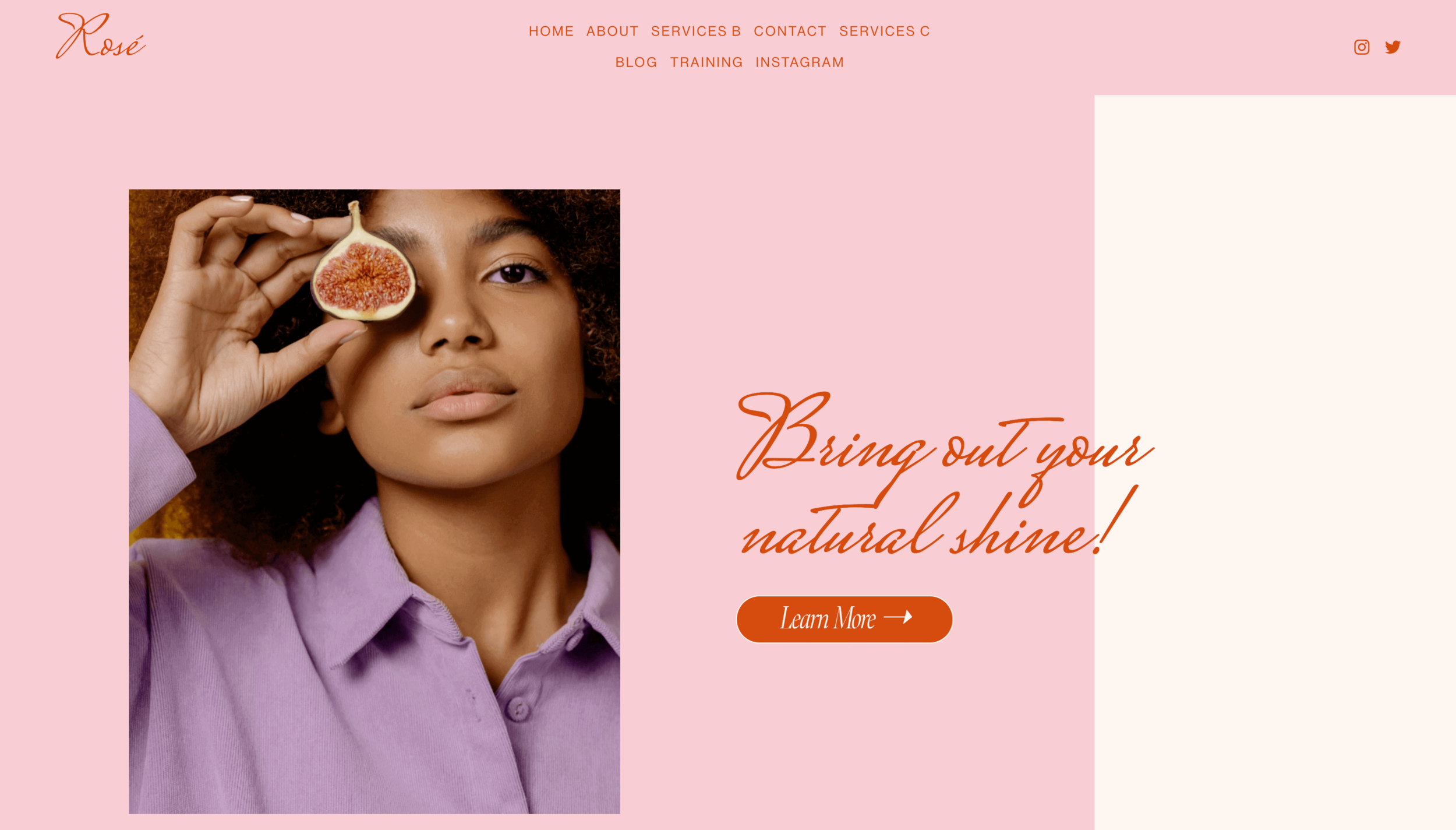
The simplicity and colorful illustrations of this website made the design beautiful. The light pink background with scarlet font added a nice touch to this clean and simple layout. Preview Squarespace template here.
9. arcana.earth

The artfully feminine brand design of the site is designed to showcase her style and personality. A blend of text and vibrant images exists in a symbiotic relationship that helps magnify each element, keeping the website homepage fresh and original. As always, the great design looks perfect not only on desktops but also on mobile devices.
related article: 21+ Best Squarespace Blog Templates10. chapter510

This clever design is appealing because of the bold illustration with a lot of color. Well throughout use of typography to attract attention. The homepage layout is different from other websites in which you can navigate through it. If you are trying to get noticed on the internet, this site will do just that. Beautifully displaying upcoming events and workshops.
11. hairandspace
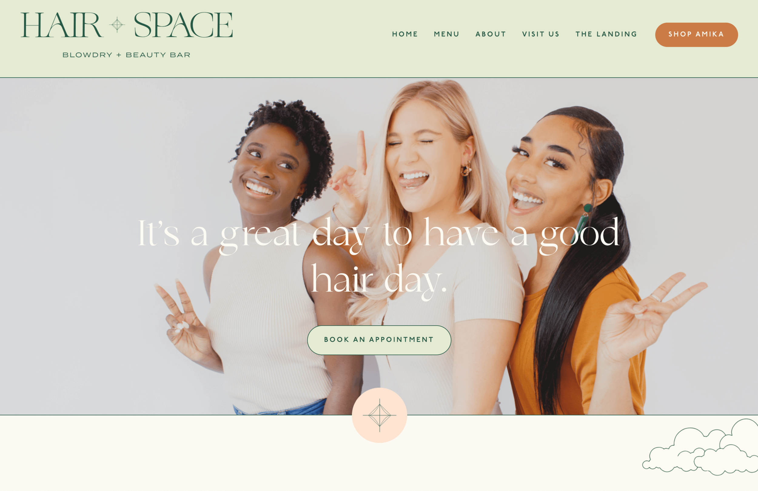
This site has a clean design with a feminine feel. The use of color creates individual elements tied together, creating one unified space. Beautiful visuals and emotive copy to create a feminine hair brand.
12. aua skincare

With a simple design, fresh layout and a unique navigation menu, this spa website design is sure to grab viewers' attention. Subtle backdrops promote business transparency, and a menu across the top header makes it effortless for customers to find the services they're looking for. Clever use of clients testimonials created the trust and established expertise.
13. alba-gil

It has a clean, fresh layout for the design firm that will make anyone feel like they are welcomed. There are no complicated flash animations. Everything seems to be in the right place. There is rich white space and tastefully diluted with beautiful photographs.
14. max la manna

More inspiration brings this website for food blogger, it is clean and bright, bringing attention to the dishes presented. The color palette is strong, vivid and achieved by hints of pastel shades.

15. wearegoodform
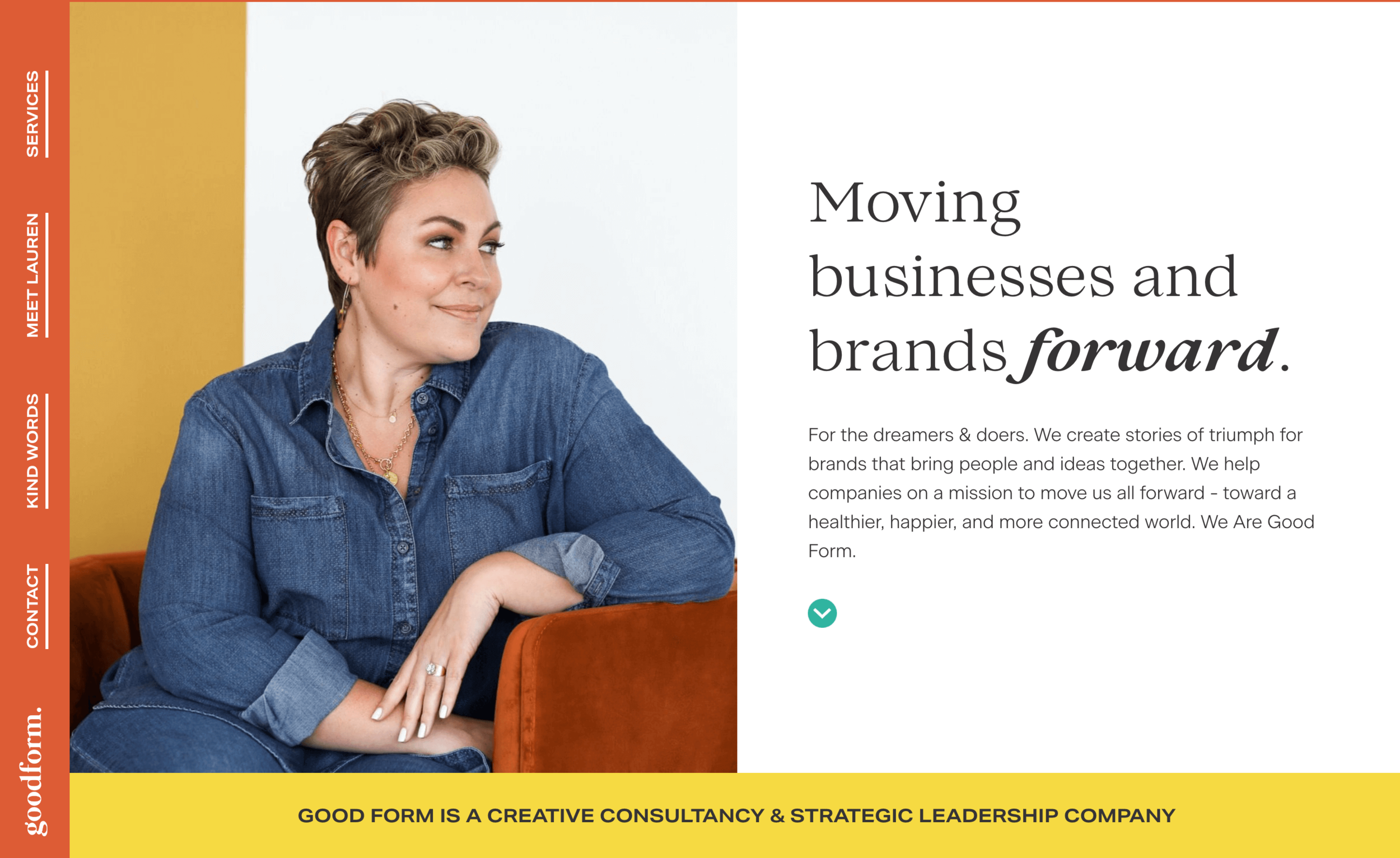
This creative homepage website layout is neat and clean with some really bright colors. I love the vibrant orange and yellow, so it brightens up this page a lot. Unique vertical navigation makes layout interesting, like you want to dig more to inspect, while testimonial show social proof. The style looks professional without being too complicated or overcrowded. Great layout for brand design studio.
16. ambercarroll
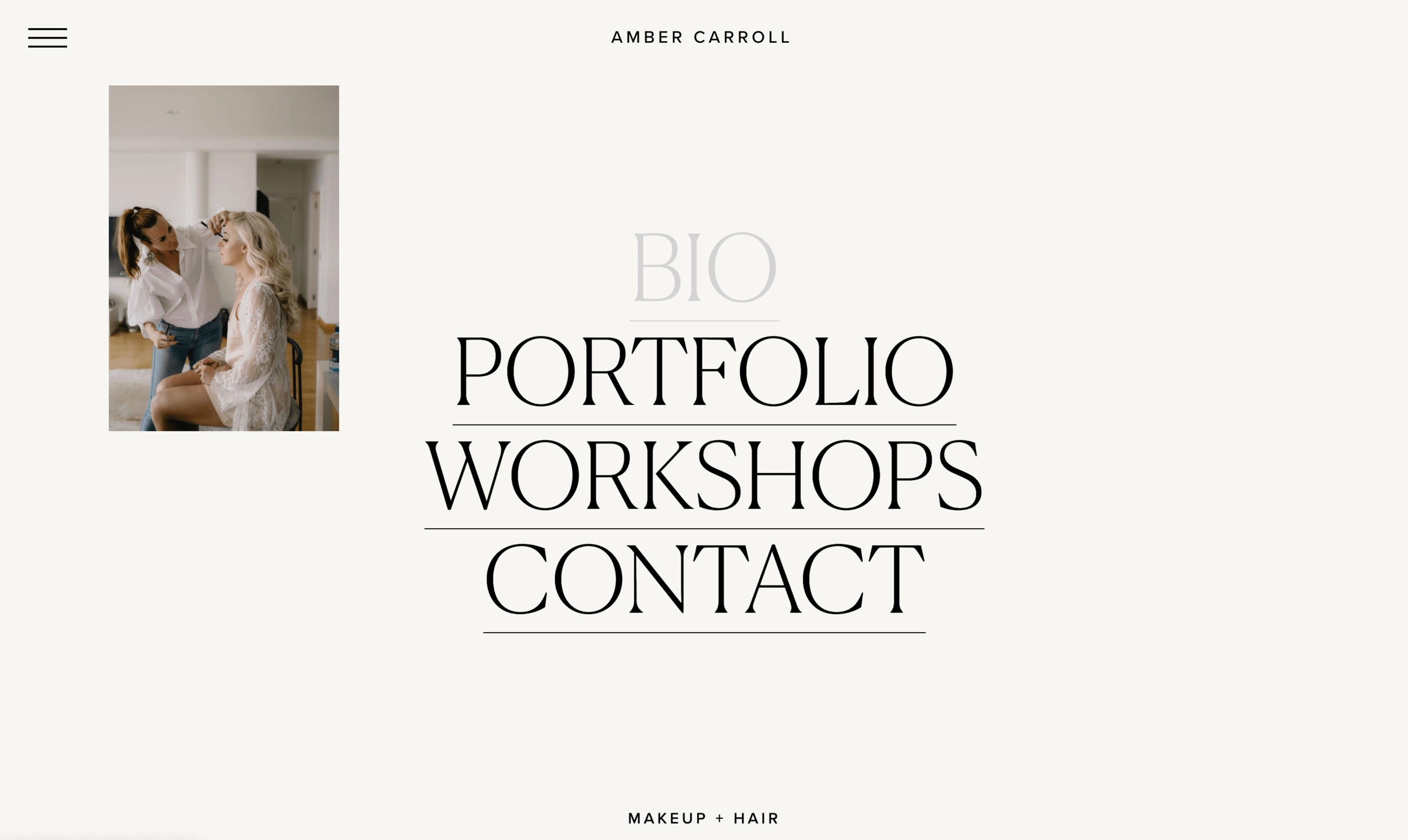
This homepage Squarespace site immediately grabs your attention. It has a lot of white open space with images on hover and beautiful typography. I love the way the site is laid out for one to navigate through it with clean lines and very little clutter. The creative header is catchy and helps set the theme for what you are about to explore.
related article: 26+ Best Squarespace Templates For Photographers17. flowercarte
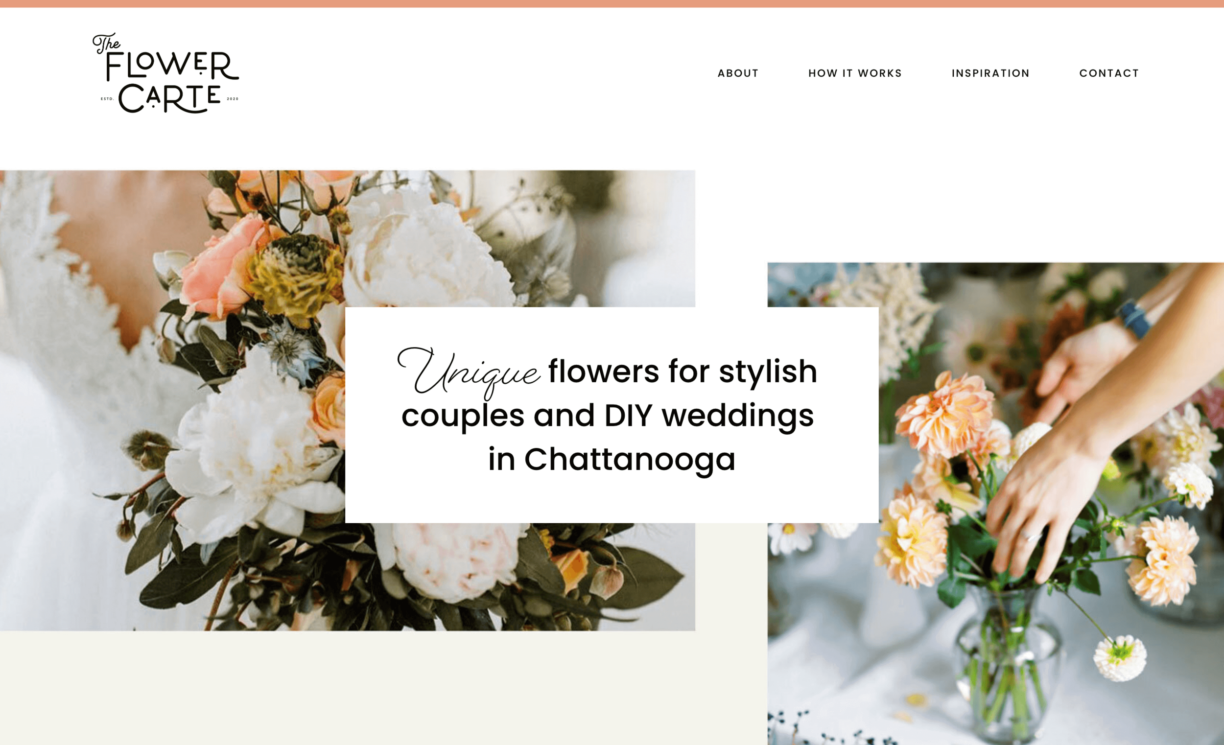
Customers don't buy products, they buy experiences. I can't think of a better way to describe the effect a beautifully designed and crafted wedding website can have on your overall business. Clever call-to-action buttons, so that customers can contact about the services.
18. kelsey blackwell
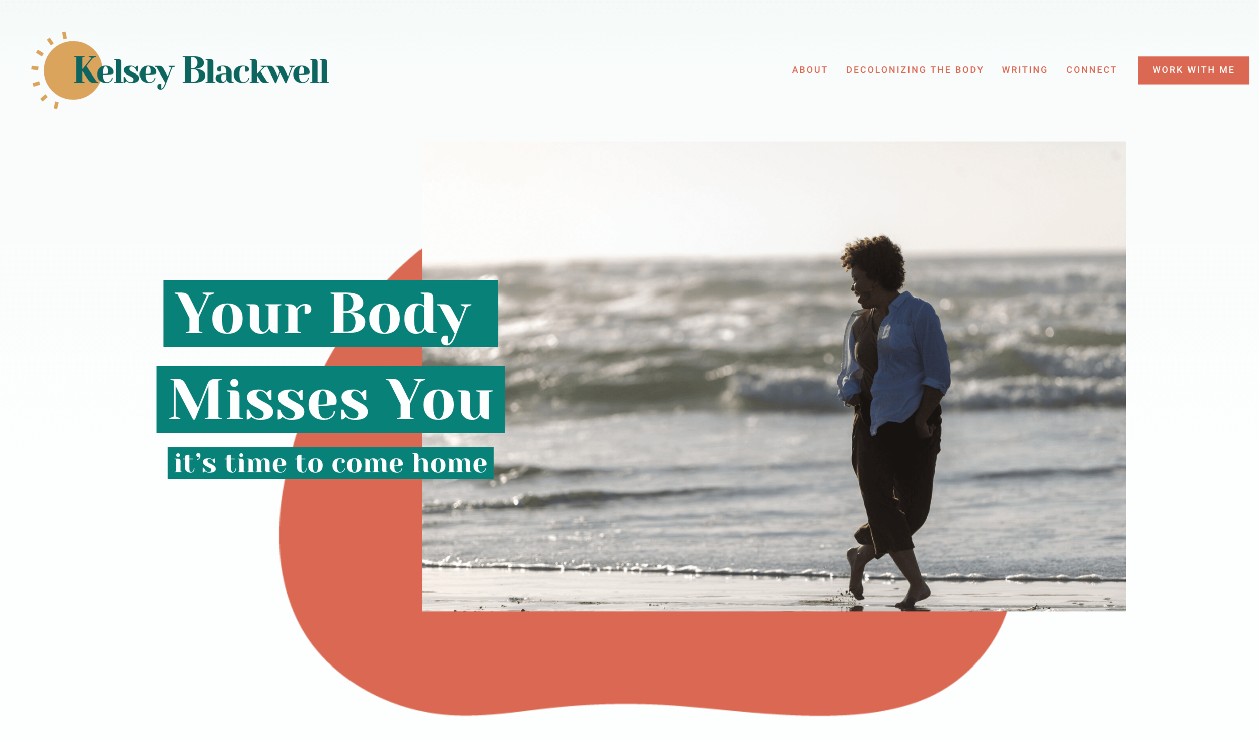
"You can't judge a book by its cover." But we do, and we make the majority of buying decisions based upon how attractive or unattractive a product looks. I think it's safe to say we would feel strongly about a book if it were hidden by a plain brown wrapper such as those used for recycled office paper. Your website is like that book. If your cover doesn’t grab attention, you probably won’t get to tell your story.
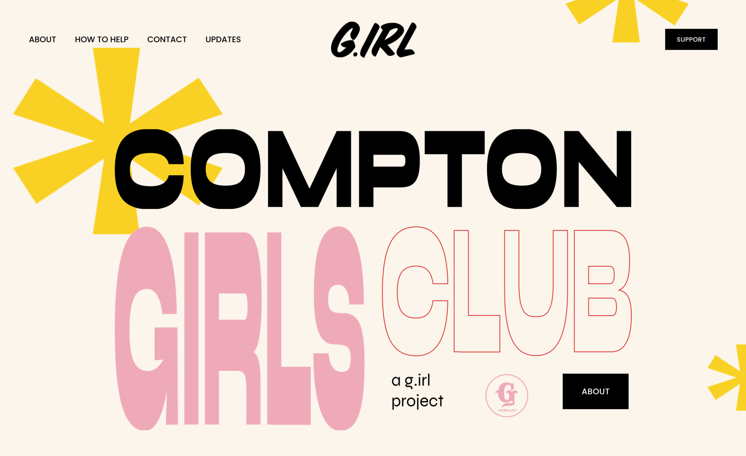
Good design is vital for any website, and design makes the difference between a fantastic and terrible-looking site. We all know that good design can also make your website more approachable. This website example uses bold pink typography complemented by background illustrations. The colors are pleasing to the eyes but yet exciting enough when you look at them.
20. courtney weimer
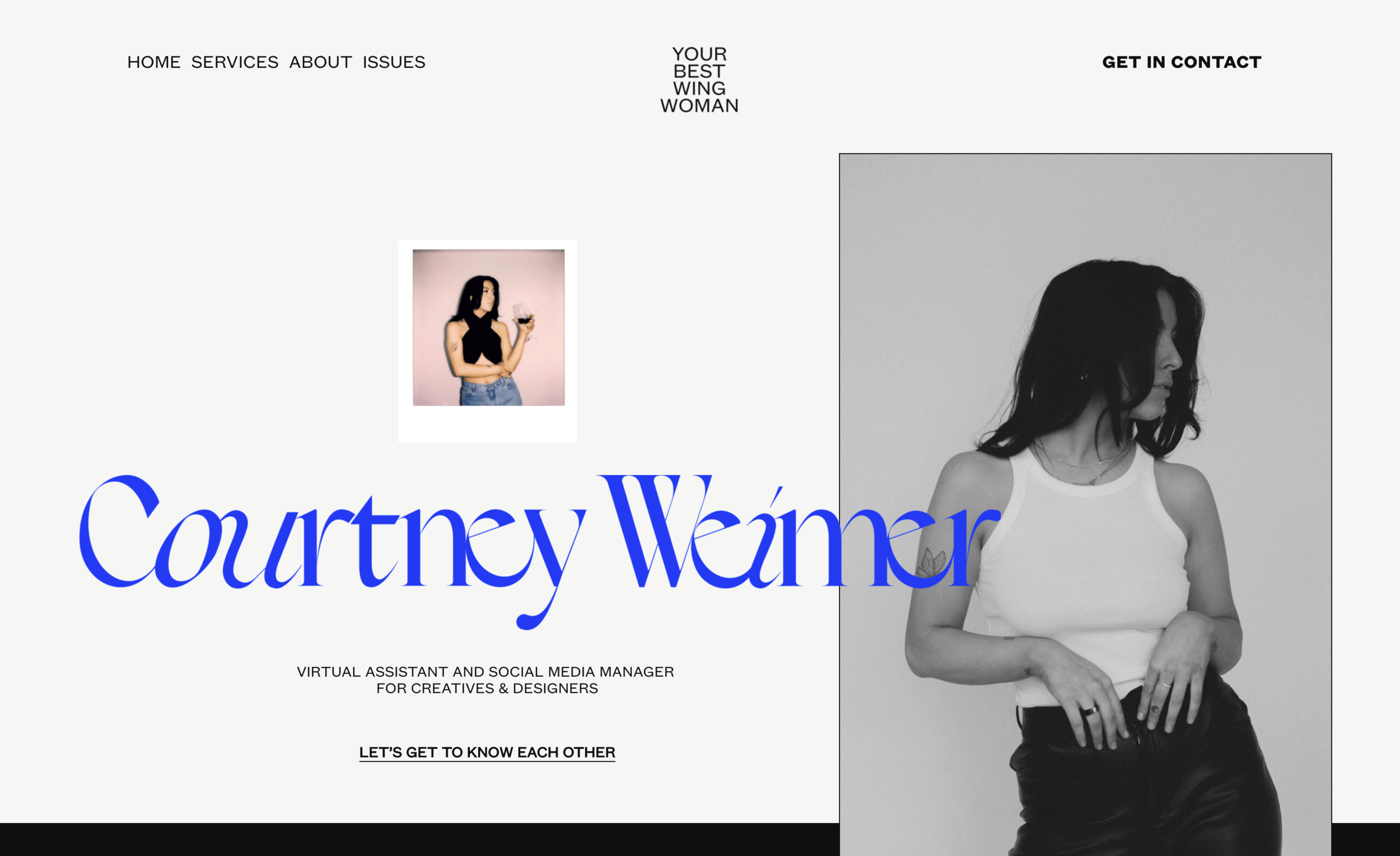
This website example has an interesting layout that focuses on typography and content by using simple blocks of information organized to create a compelling composition. Blue color dominates the typography, combined with a light gray background and broken up by images. All the elements on the page create a visually appealing look.
21. latinxmktg
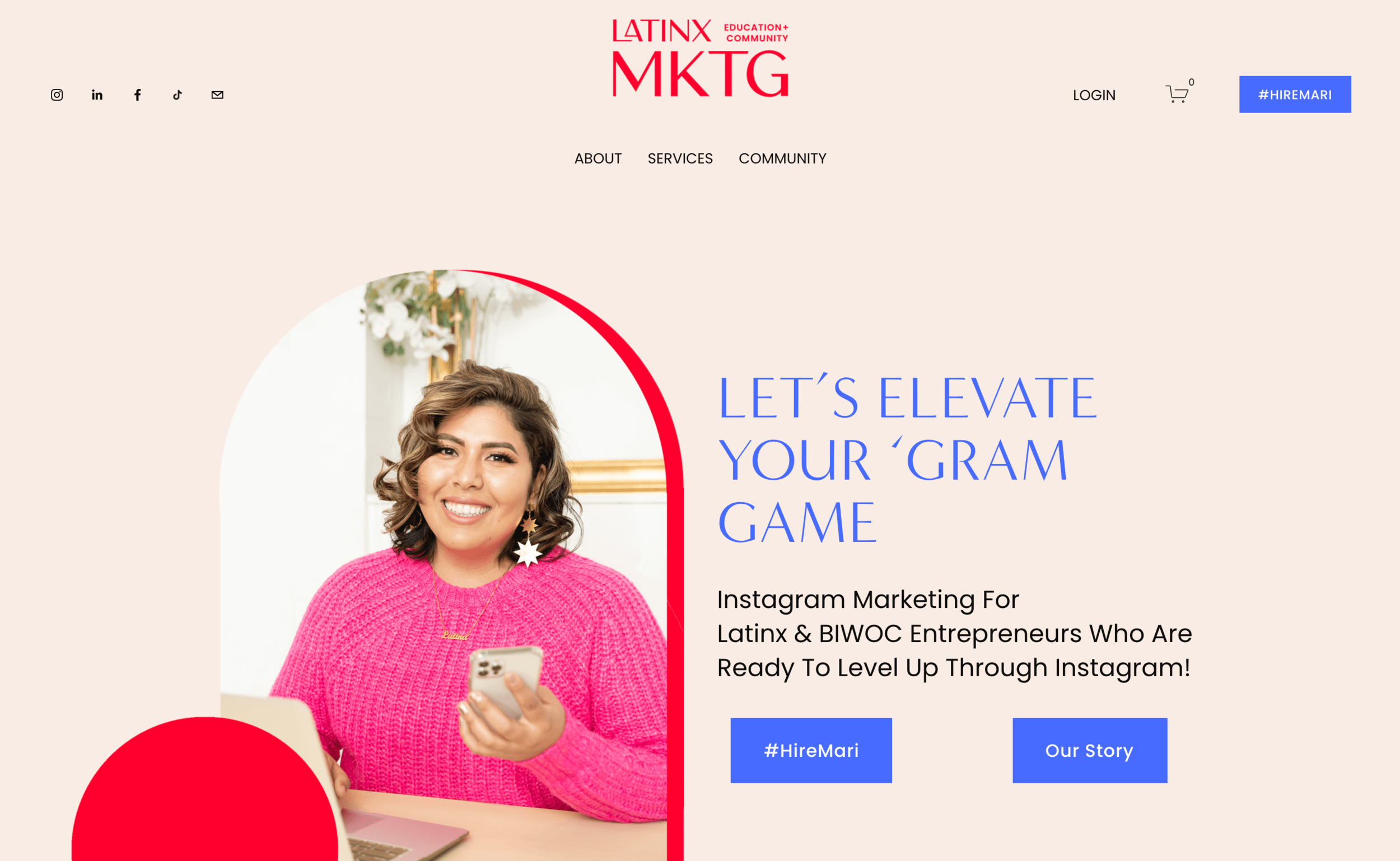
This website design layout has a feminine color palette that contrasts curves and circles. The menu moves smoothly but also changes shape giving it dimension. This website layout has a few interesting shapes, like circles and arches. They help create a more exciting atmosphere. This is definitely an intriguing design layout.
related article: 14+ Premium Squarespace Templates Shop For Any Business
This design has a feminine colors with interesting geometrical shapes and flower illustrations. The overall design is very creative and interesting. It's a really different layout. The color palette is bright, fun and inviting. You can't miss the great amount of personality that this website has to offer. There are a lot of great uses of shadows, blooms and even geometrical patterns.
23. idaliainc
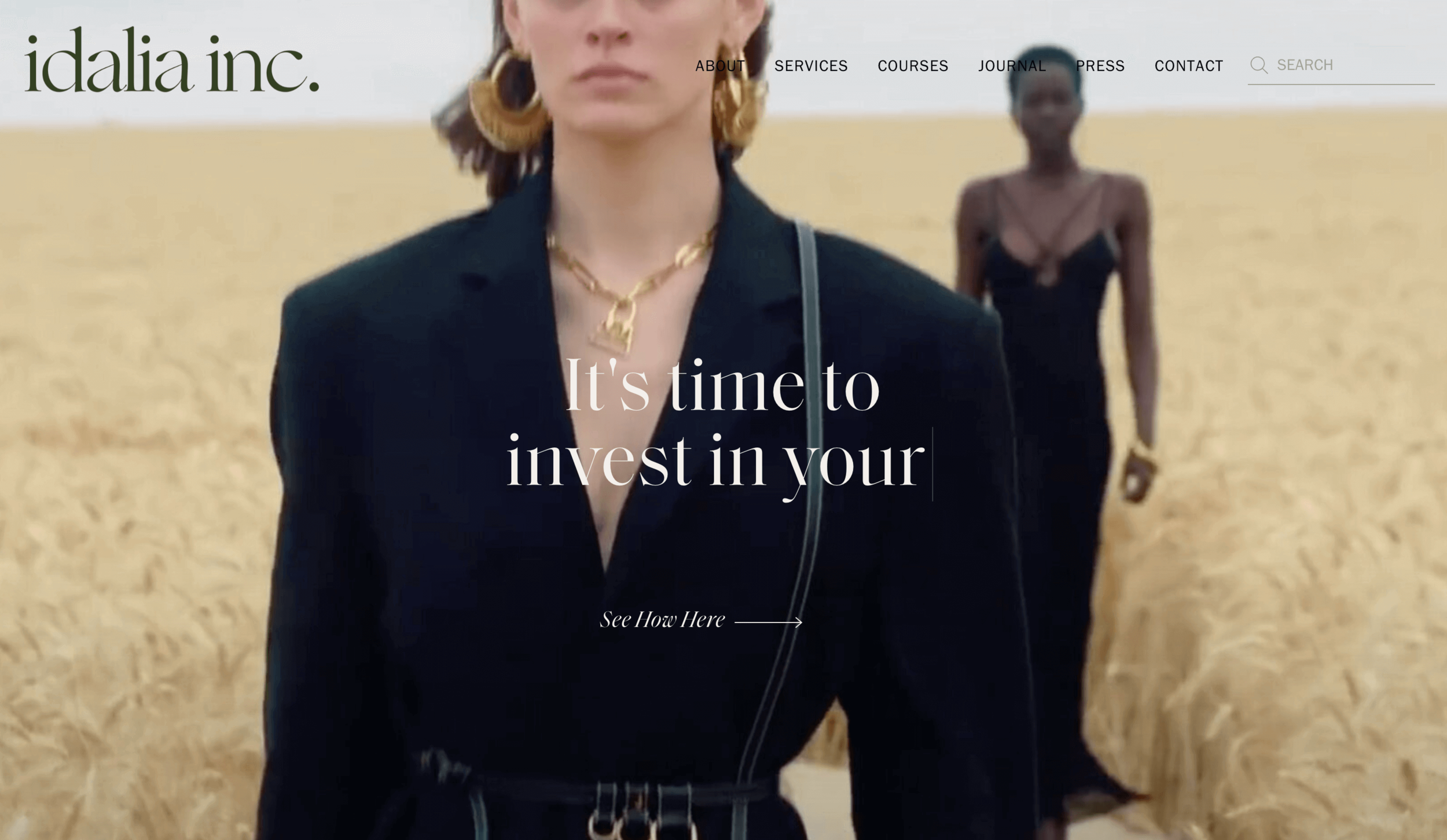
This website layout has a lot of white space and feels open. Big, high-quality bold photos dominate the layout and add instant elegance to the design. The typography is elegant too - all in all, this website layout is perfect for an editorial website with lots of content.
We’ve all heard of or seen minimalism in art, fashion or home décor. It’s become more of a global trend over the last few years. People are choosing flat design style for mobile phones, websites and applications. I’m not sure whether minimalism is just a trend, or it will be here to stay. That’s something that will be answered in decades. Following the trend, this website design is very minimal, with a light-toned background and a tasteful food photo to make its point.
This website design is clean, with a white background. There are large photos on the homepage, all of which are taken by author. Some photos are very close up shots while others are more zoomed out. There is a lot of consistency in the shots, which is important for this website design. The layout also makes it easy to navigate through the website and find what you need quickly. The light grey navigation bar at the top is well organized and lets you know where to go next.
Here is another example of beautifully simple, modern Squarespace website design The dark background gives an impression of quality and professionalism. TTouches of pink make it look interesting and catching. It also balances out the composition and typography.
related article: How To Create A Blog In Squarespace. Step By Step Tutorial27. asiyami gold
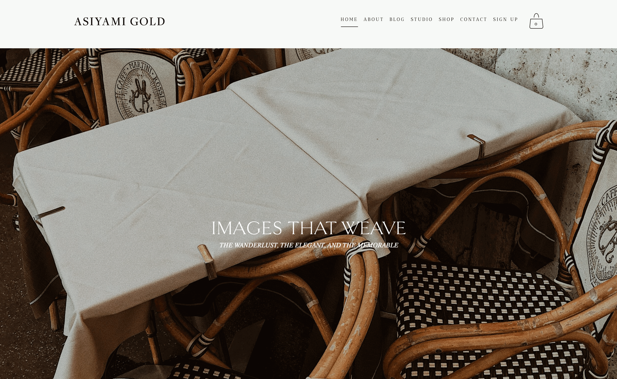
This lifestyle website makes good use of white space and beautiful photography. The design is clean lined and modern, but also has an artistic flair through the use of negative space for header images and typography choices. The end result will be clean looking posts that are easy on the eye and simple to read, while still maintaining a sophisticated aesthetic.
28. lottie and twigg
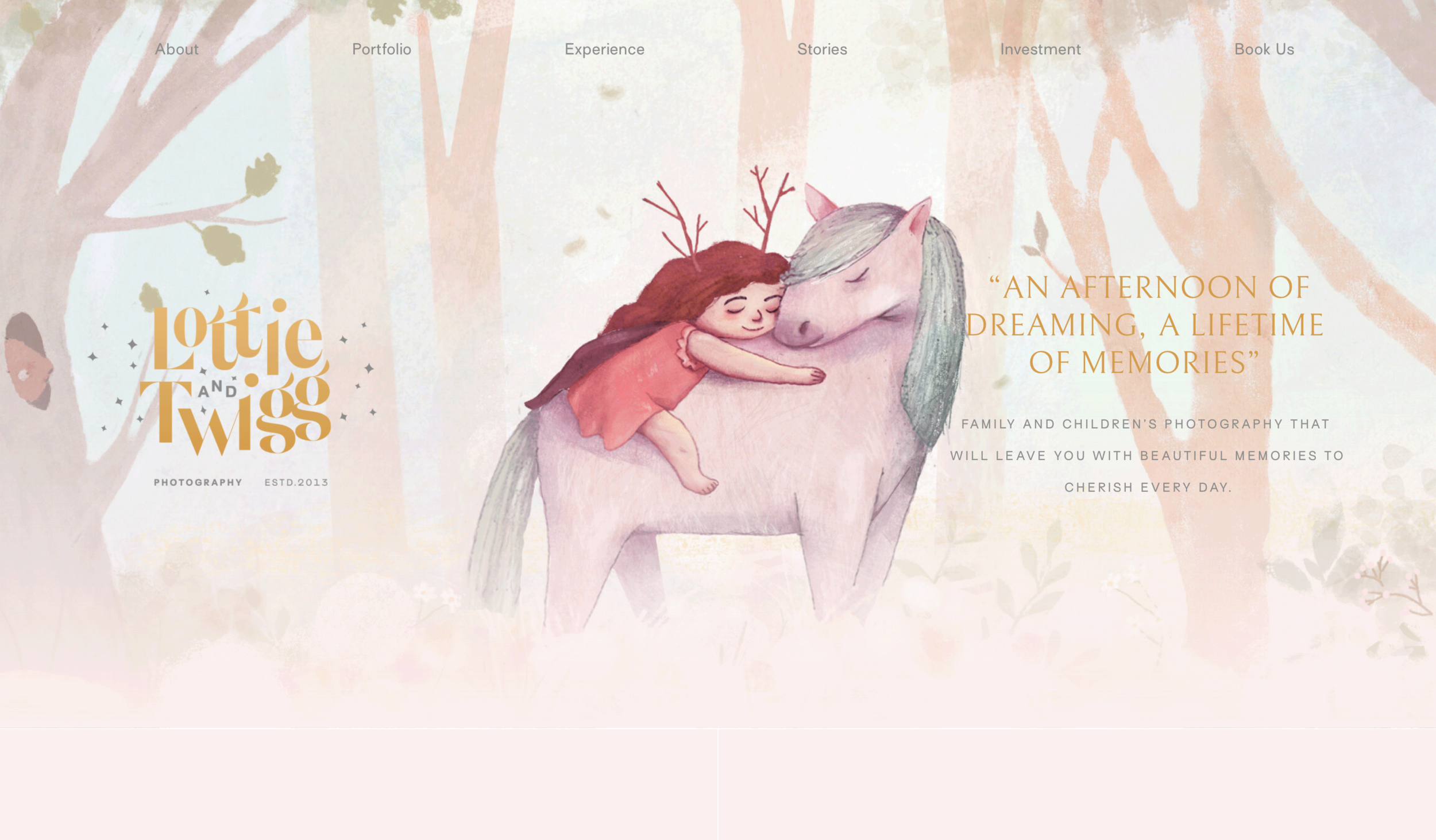
Here is a website design with stunning illustrations, just like those found in picture books. The website design is clean, fresh air, cute font colors are perfect for children's heart.
29. eunicebeck photo
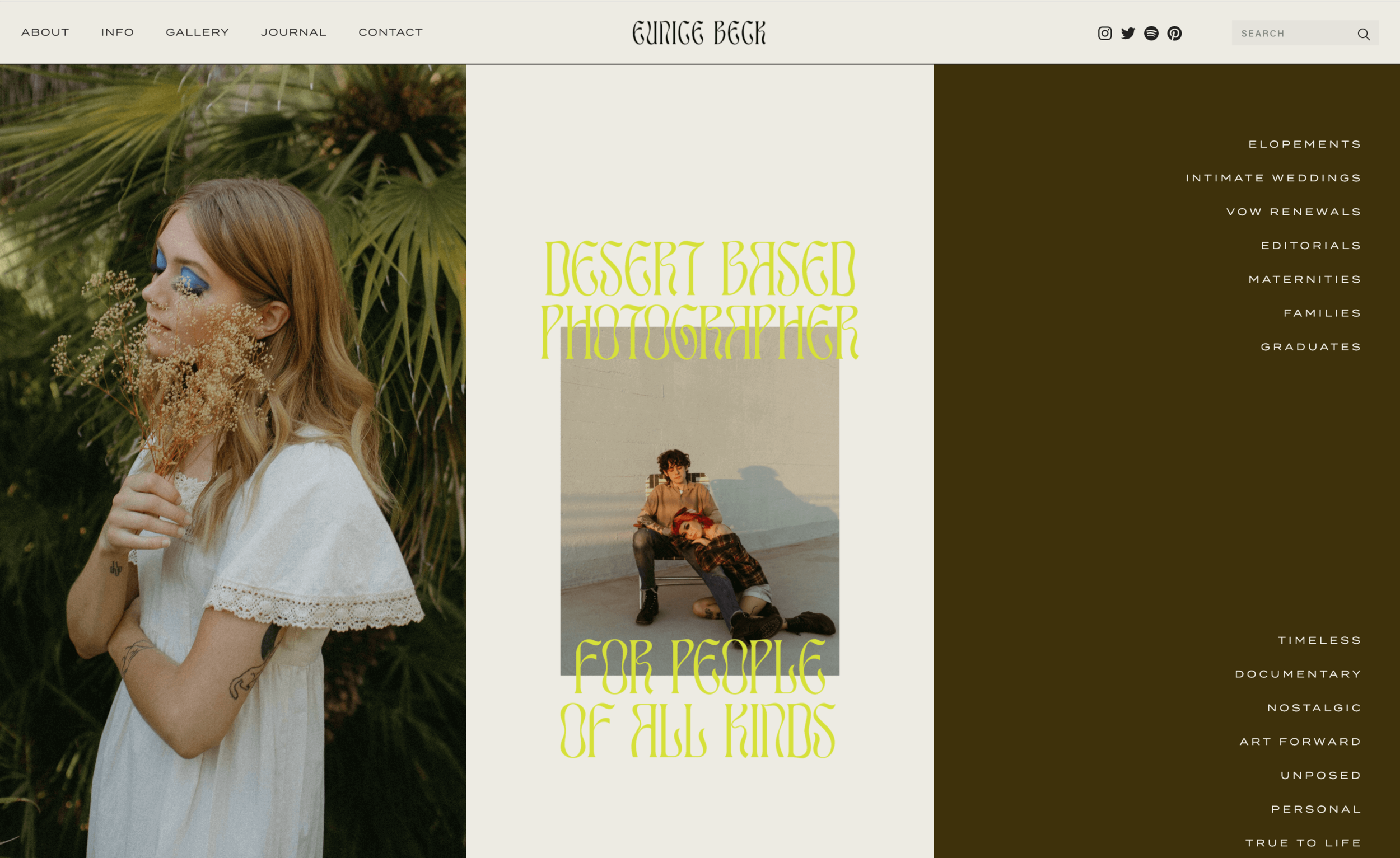
Here is another example of photographer website, with interesting layout and funky typography. This portfolio website is wonderful in terms of layout and interesting combination of colors that draw attention to the features on the photography section on this website. The colors are vibrant and have been used in an interesting way on this site which showcases some obviously great photos.
30. zenobia studios

Bright geometric shapes combine with beautiful imagery and elegant typography to create a standout website design. This website is really interesting, with its funky typography and layout, yet it doesn't look overcomplicated.
related article: How To Build A Squarespace Website: A Step-By-Step Guide 31. crystal britt

This is a great example of a website from the point of view of a designer. It’s not one of those designs where you have to look at it for five minutes before you actually notice something has changed. Everything blends together so well, and the colors are so vivid, it’s hard not to see them as soon as you enter the website.
This website uses a lot of white space, making the content section more prominent and easy to follow. The branding is very clear, with a very dominant logo at the top of the page. The use of photography also makes it more appealing to the eye, especially on a clean white background.
33. meg biram
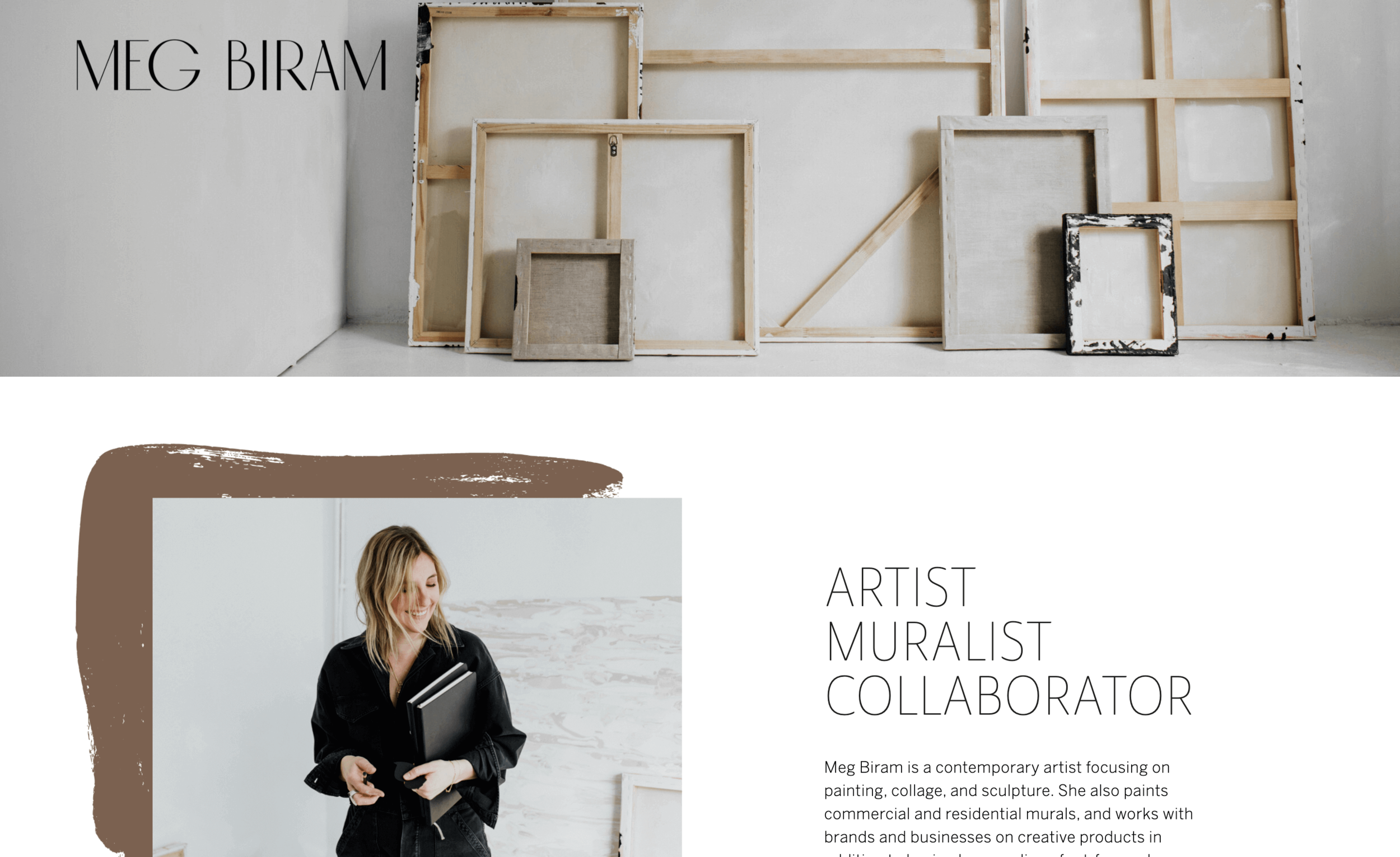
Just like colors, shapes can also be used to create a design composition that is well-balanced and interesting. If you’re designing a website and want to break free from the traditional grid that most modern websites use, then try adding different shapes to your design. Just like this website uses paintbrush shapes to create interesting design accents on the page.
34. drkarendoherty
This website is an excellent example of how beautiful photos can serve your design . The colors are pastel and subtle, with a soft photographic quality. This helps convey a feeling of calmness and happiness with soothing color tones.
35. hopedella
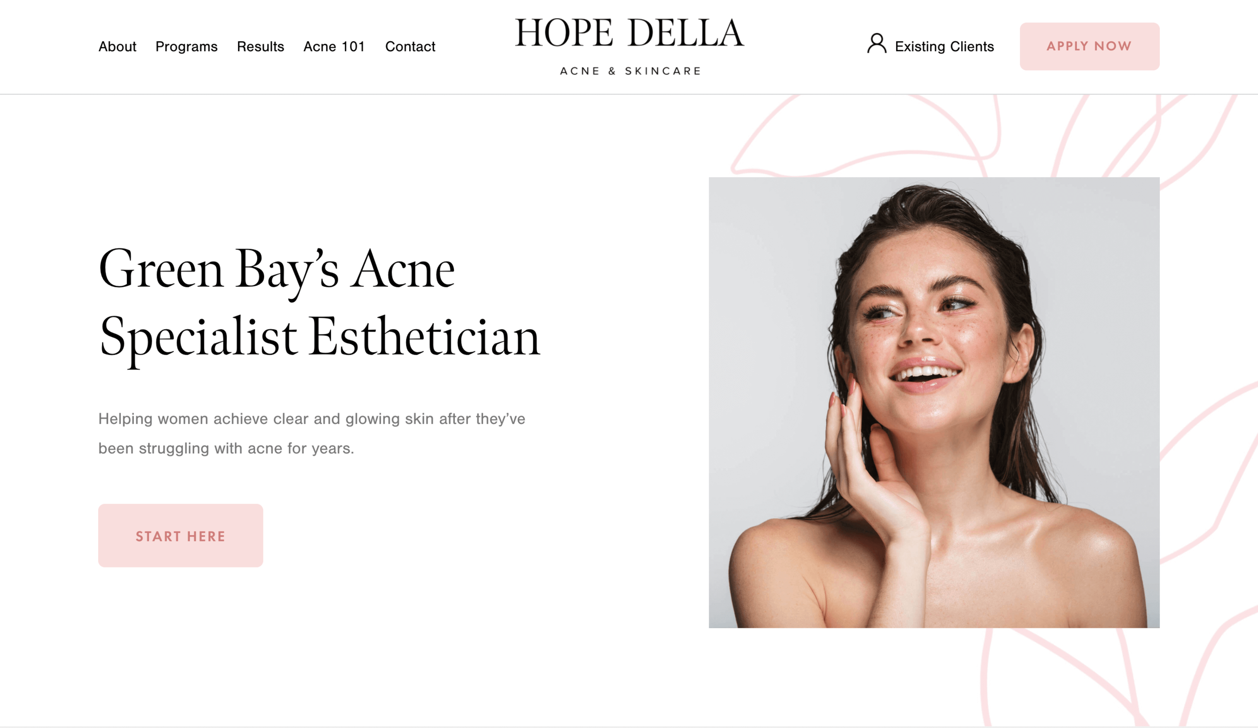
The illustration and color work together to balance out the design, bringing a sense of playfulness and fun combined with a level of sophistication. This website is an excellent example of how beautifully color can serve your design, regardless if you're using "bright" colors or more muted tones. It can add depth to your layout or draw attention to certain elements on the page, which in turn may lead to visitors becoming engaged with your content.
Patterns really help you stand forth from the crowd. They imprint a solid mark for your website design, making it seem out of the world and unique from others. The use of patterns, textures, images and bright colors can make a boring design into a very human-oriented design. And here is a good example of a website that does it well.
37. jessica boston
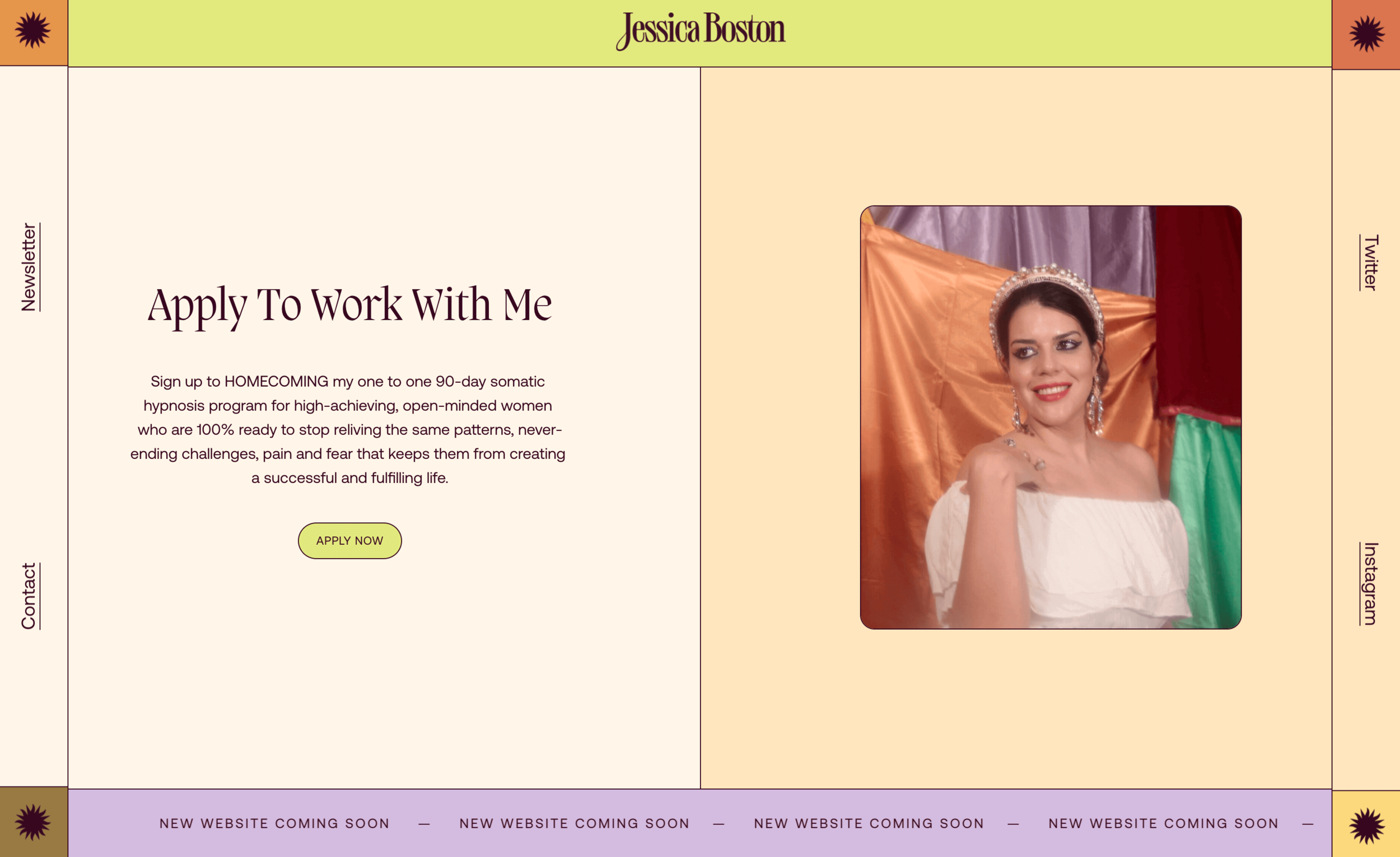
A website with bright colours won't go unnoticed. Colors simply affect the mood of a website and the people visiting it. Different colors trigger different emotions, appeal to a niche market, and communicate a message. It plays a vital role in user interface design.
What I love about this site is it's minimal muted look. It gives off a very calm feeling which is ideal for a coach. The muted design mixed with the neutral colors makes it easy to read which is ideal for any type of business website.
39. kecia robinson

It should come as no surprise that one of the essential elements of any website is the home page. This is where you can immediately make an impression on potential customers and start building trust with your visitors. The use of large, high-quality photos makes the website draw visitors in and keep them engaged. This Squarespace website is an excellent example of good use for a hero image.
40. anni graham
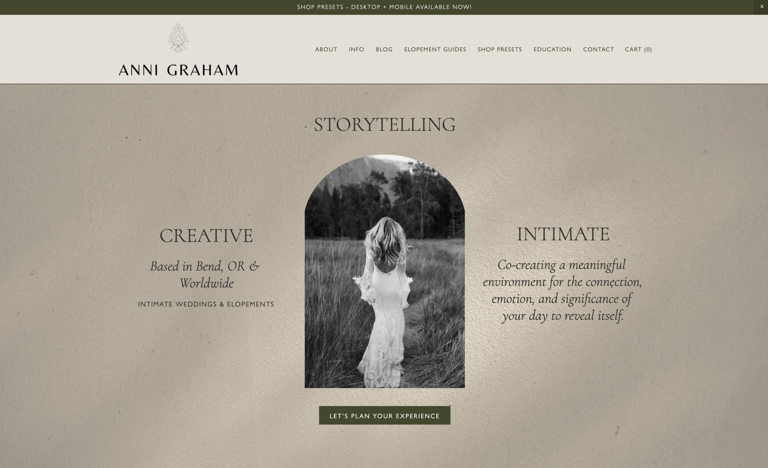
Design is more than colors, shapes, and fonts. Design is an art, which means proper design is subjective. Everyone has their own interpretation of what looks good. Creative websites are the ones that are able to stand out among all the rest. They’re unique through use of texture, pattern, geometric shapes, and bold fonts in different sizes that are all in harmony with one another.
The website's homepage greets the visitor with a large hero image that captures their attention right away. The homepage itself has muted colors that are created by cleverly contrasting shades. This grabs the visitor's attention in an exciting way while also establishing the mood as unique through use of texture, pattern, geometric shapes, and bold fonts in different sizes that are all in harmony with one another.
Blue is an excellent color for a website layout. It is a calming and a relaxing color that can be effective for calming users’ nerves. Which really serves the purpose of this website – to create a calm and relaxed impression to its users.
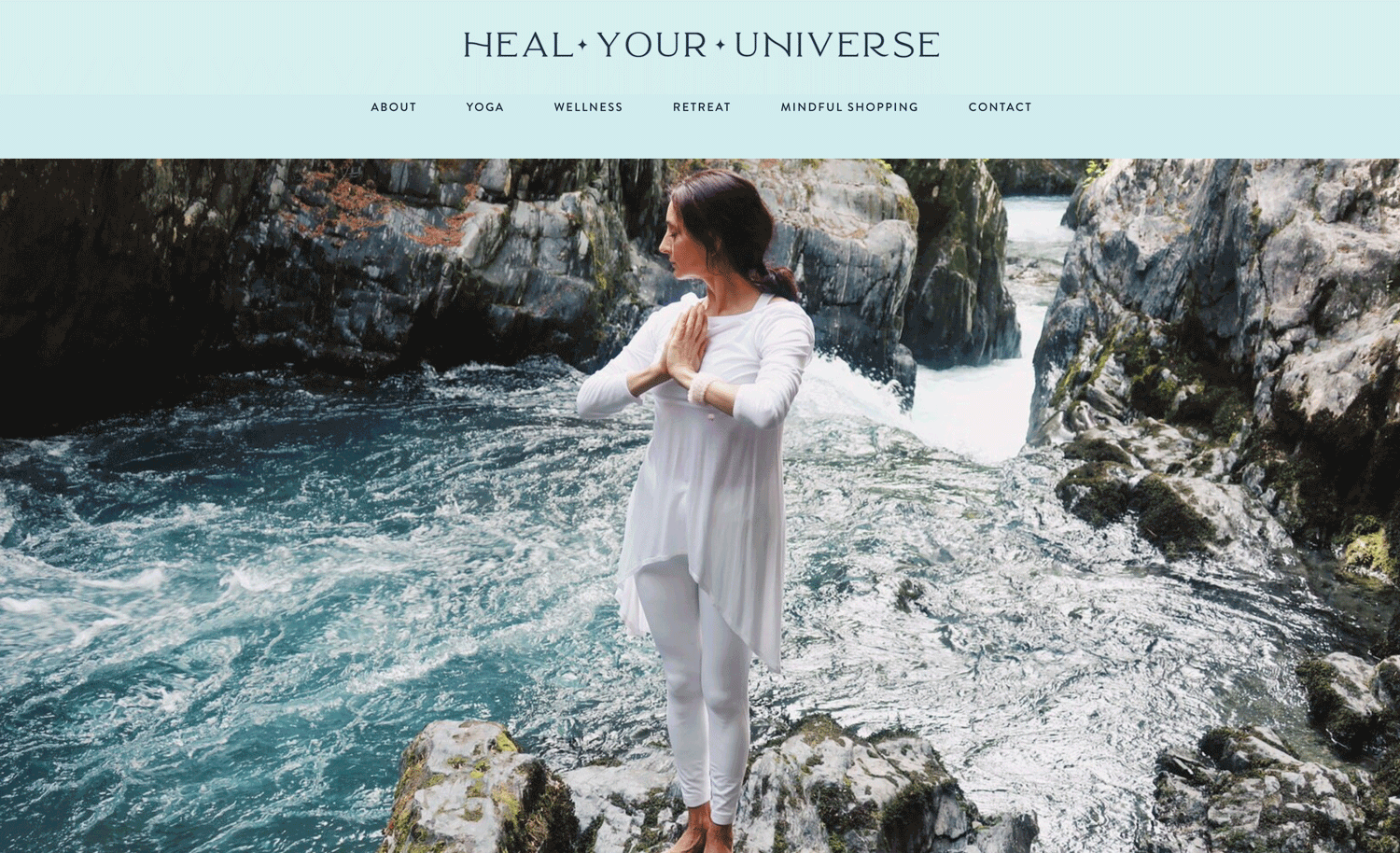
43. ventura health
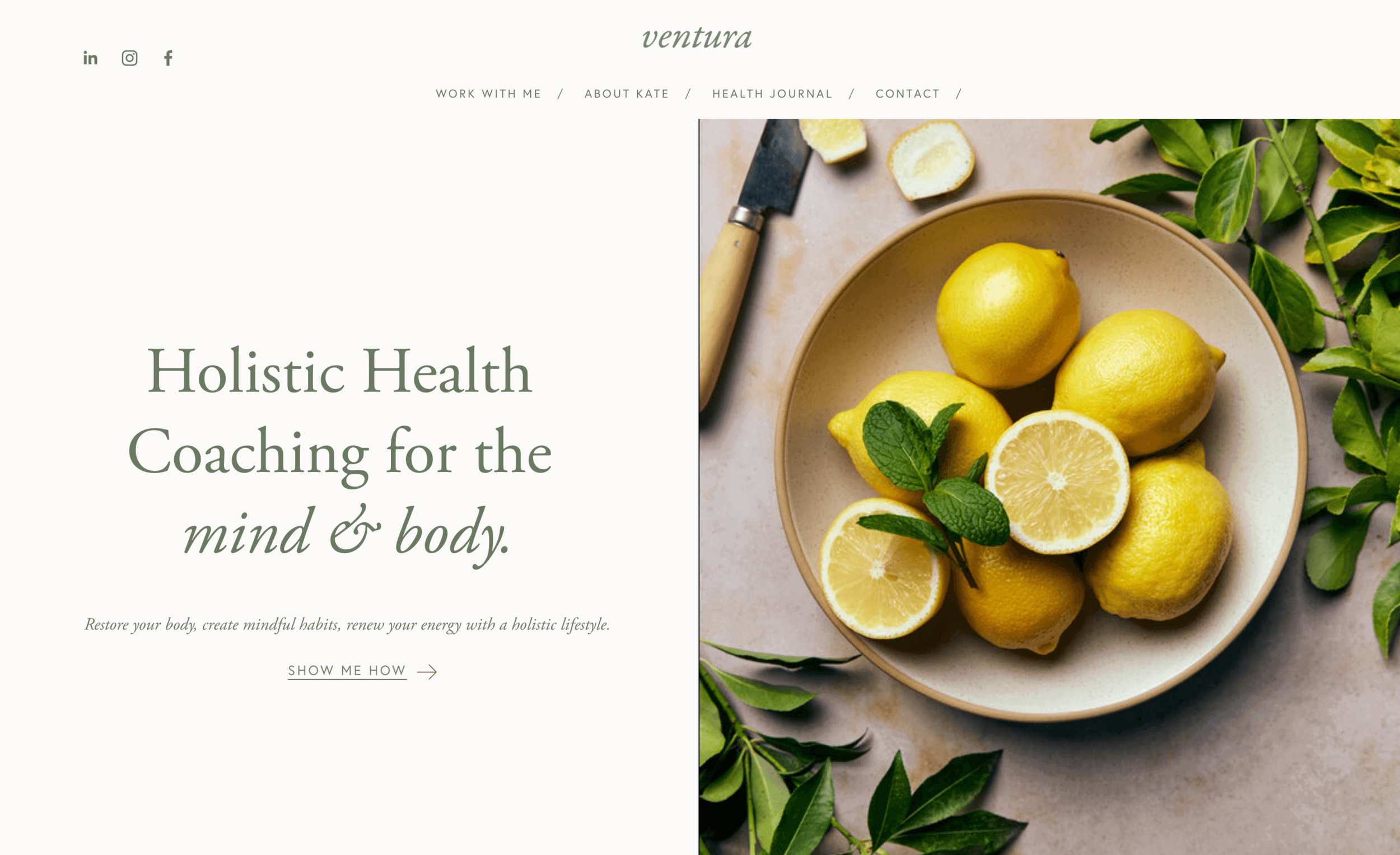
What strikes me as unique about the minimalistic design is its clear-cut and straightforward design approach. Minimalistic designs usually use a limited number of visual elements and enable the user to focus on one particular aspect of the website, without being distracted by any further visual information. This is a great example of how minimalistic design can serve your business website
related article: Beauty Salon Website Template For Squarespace44. pentawest

Website design is a dime a dozen these days, but nevertheless, some designs stand out from the fray. This website explores the boundaries of website design and blur the lines between art and information to highlight a beautiful use of colors.
45. laurenanddouglas
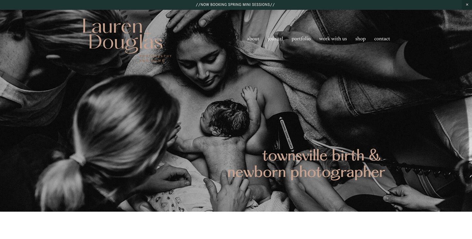
From the moment you land on this page, you are stricken by the beauty of this website design. A black and white photo that is complimented by beautiful color and typography. A soothing background with a single type of texture. The combination of these elements makes the front page of this site absolutely stunning.
46. brainyogagame
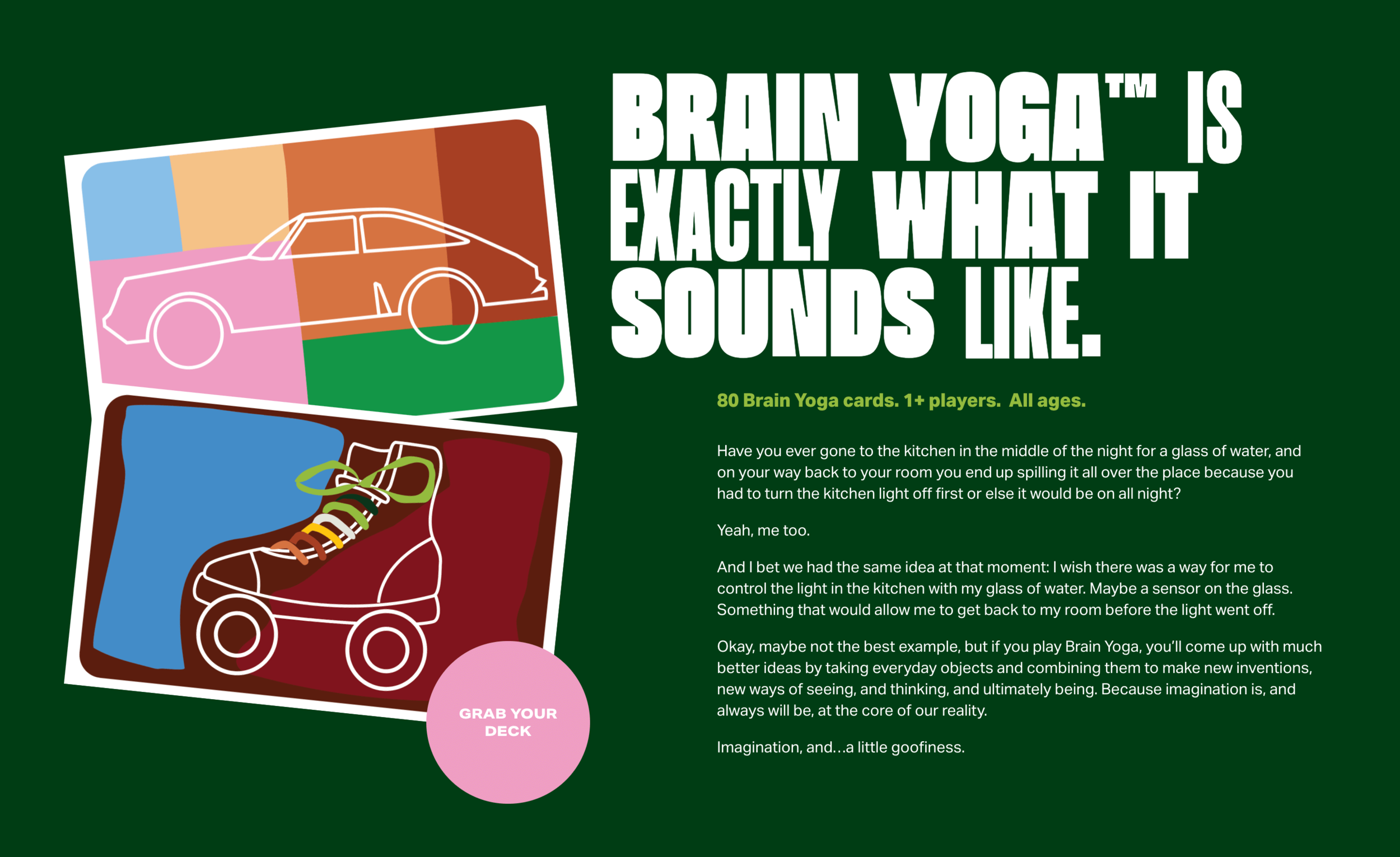
Color plays a significant role in the overall design composition of your website. It can make or break your design. Color is one of the easiest elements to change, yet it has one of the biggest impacts on your site's perception. This website is an excellent example of how beautifully color can serve your design.
related article: How To Create A One Page Website With Squarespace47. casita
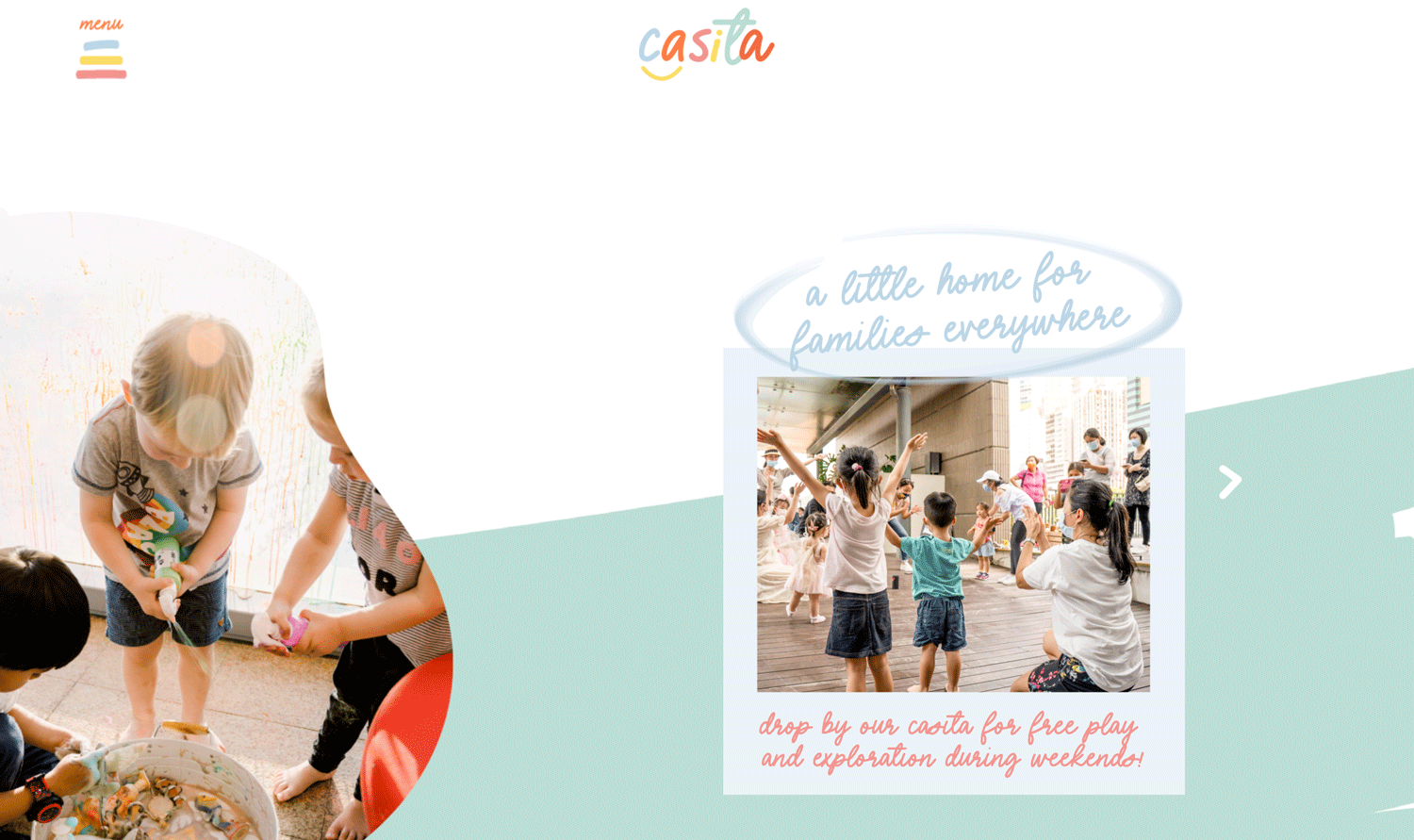
With so many colors to choose from, it can be hard to know which ones will complement your design best. This website does a great job with using color to add personality while maintaining an organized layout throughout the site. It also serves well the purouse of delivering information to the kids.
This is a great example of using and maintaining color in an organized fashion throughout the site. It also does a beautiful job of keeping the clean, enjoyable colors without "overwhelming" the site's content.
This is a great website example that uses plain black and yellow colors to its advantage. The site is mostly white with yellow and black accents. It also utilizes negative space to create a better user experience. The black background provides a sense of depth with the white text, and the yellow CTA to stand out enough to be noticed without ever becoming too distracting.
This is a great website design, with an easy-to-use layout, attractive colors and textures. It's something that will not only attract new visitors, but also keep your current clientele happy. The information is clear and concise, making it easy for you to provide your website visitors with what they need when they arrive.

Find inspiration with this simple yet modern website. This site stands out because of its minimalist design. There are no distractions going on in the background, and it makes use of bright purplish colors to highlight the important things they want you to read. You can’t help but admire this clutter-free website

Holistic Academic makes use of bright colors and alternating boxes to hold the attention of viewers. The use of images and limited colors makes every piece of information stand out and captivating. One thing I love about this website is its simple, straight-to-the-point homepage, and legible fonts.

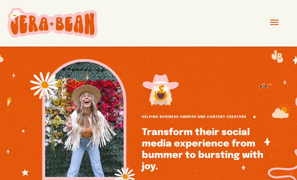
This website is a dealbreaker! Let’s start with the joyful motion image that brings a smile to every viewer's face, and truly makes them feel at home. Then the right choice of colors makes the website thrilling. The blue color tells viewers that the site can be trusted, and the bright colors used for their call-to-action buttons attracts every viewer’s eyes. This site also makes use of clean, legible fonts that passes the information out expressly. Carver Twins is a great website inspo if you’re looking to build a trustworthy, captivating website for your business.

This website succeeded in combining bright, opposite colors seamlessly! The use of colors to highlight their information and images to wet the appetite of users is a great strategy for a website like that. Senza Glutin shows you that any kind of website can be built to attract.

Whether you like it or not, viewers will either stay or leave your website depending on how your website looks like. This website succeeded in using different colors to keep viewers interested in the information. Also, they make use of different shapes to add some fun to the whole site.
Whoo! This is one big, beautiful website! The combination of the bright colors makes the website fun and beautiful at the same time. This site also succeeded in using high contrast colors to make the text stand out. You can’t help but admire the creative use of images and text colors to keep readers glued to every single text. This site is one of the best inspo if you want to create a unique, beautiful website that any viewer won’t forget in a while.

The neatness of this website is so admirable. From the use of colors to the text, to the arrangement of the content. This website creates a seamless flow through it. The use of cool colors gives the website an overall calm and relaxing vibe. Images were also placed beside important content to give a better visual understanding for viewers. Another thing to take note of is the beautiful orange circles used to highlight the call to action buttons.
best squarespace website examples
While the process of designing a website can be challenging at times, it doesn't have to feel overwhelming. By getting inspired by these examples, you can get a head start on creating your own successful site. As always, if we missed any truly great websites, let us know about them in the comments below. In the meantime, use this post as a starting point for your next design and let us know how it goes in the comments!